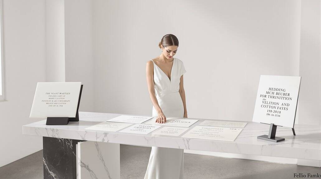
To create expensive-looking invitations, pair a refined serif font (like Didot or Baskerville) with a delicate script, maintaining a strict typographic hierarchy. You’ll need generous white space—aim for a 60/40 ratio favoring emptiness. Manual kerning adjustments of 2-3 pixels between problematic letter pairs (WA, TO, AV) enhance perceived craftsmanship. Avoid default fonts at all costs; they scream amateur. Your typography choices are tactical signals of value, transforming simple cardstock into something guests will preserve rather than discard.
Typography as Luxury Signal
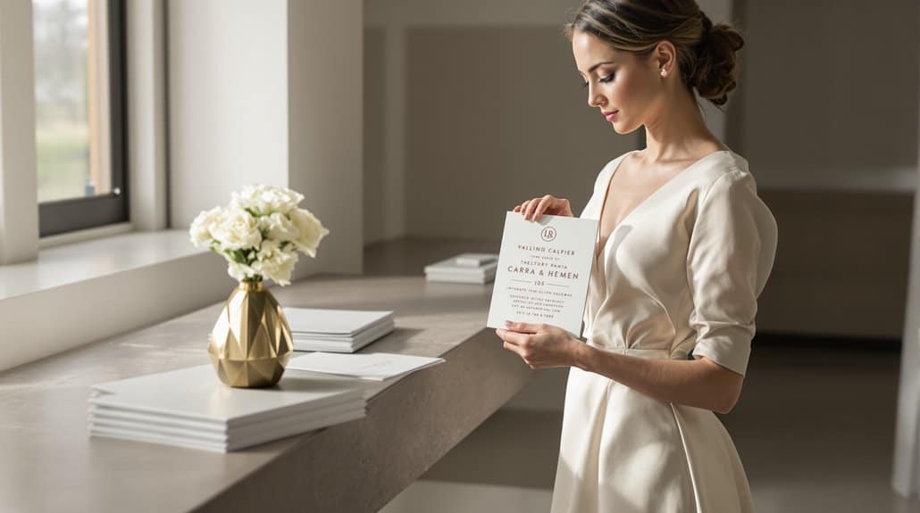
While any designer can select a font, it’s the deliberate typographic choices that separate luxury brands from the merely functional. Your invitation’s perceived value hinges on typography that whispers exclusivity before a single word is read. Serif fonts—particularly Bodoni and Didot—immediately telegraph prestige, with their elegant contrasts between thick and thin strokes creating visual aristocracy. These aren’t merely letters; they’re heritage embodied.
Script typefaces drive this perception further, increasing perceived value by up to 43% compared to alternatives. When you’re crafting luxury invitation typography, understand that flowing cursive letterforms trigger psychological responses signaling rarity and craftsmanship. Script fonts create a visual pause that allows your invitation to be truly seen and remembered. But refined type pairing demands restraint—pair a bold serif header with delicate script accents and watch perceived value soar. Premium cotton paper provides the tactile foundation that allows these typographic choices to truly shine, transforming words into tangible luxury.
Expensive font choices aren’t about flash; they’re calculated decisions that exploit deep psychological connections. Your invitation isn’t just communicating information—it’s transmitting status through centuries-old visual language.
Font Pairing Sophistication
How precisely do you raise an invitation from merely acceptable to undeniably luxurious? The secret lies in strategic font pairings—where typographic chemistry transforms paper into experience.
Begin with the classic serif-script combination, a timeless approach to elegant invitation design. Pair Libre Baskerville (Tiffany’s choice) with a delicate calligraphy for immediate sophistication. And yet, elegance isn’t confined to cursive; contrast is key. Heavy typefaces offset against lighter italic variations create hierarchy that guides the eye purposefully.
Elegance emerges when serif meets script—the invitation designer’s quintessential formula for typographic distinction.
Luxury invitation typography demands restraint—two fonts maximum, three when including a monogram. August Roma Serif, with its extensive swash options, paired with clean sans-serif creates the perfect tension between tradition and modernity. The incorporation of SVG script fonts alongside serif creates textural depth that exudes romance and sophistication. Just as quiet luxury aesthetics favor understated refinement over ostentatious display, your typography should whisper exclusivity rather than shout it. But remember this: contrasting weights within a single typeface can achieve nuance without overwhelming your design.
The refined invitation fonts you select communicate quality before your guests read a single word—making typography your most powerful unspoken signal of exclusivity.
Hierarchy Clarity and Precision
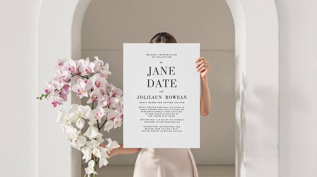
Although invitations communicate essential details, their typographic hierarchy determines whether guests merely comprehend or genuinely anticipate your event. Expensive looking invitations establish precision through calculated size relationships—your headline should command attention at three times your body copy’s size, creating immediate visual authority. You’re not just designing text; you’re orchestrating visual priority.
| Element Type | Size Ratio | Weight Application | Color Strategy |
|---|---|---|---|
| Names/Titles | 3:1 | Bold/Semi-bold | Primary color |
| Date/Venue | 2:1 | Regular to Medium | Secondary tint |
| Details | 1:1 | Light to Regular | Neutral tone |
Luxury invitation typography demands intentional case treatment—reserve uppercase for names while using mixed case for supporting information. And yet, the real sophistication emerges through spacing: your typographic elements need room to breathe, with generous margins that frame content like artwork in a gallery. Just as museum-quality display transforms heirlooms into curated statements, proper spacing elevates invitation typography from functional text to visual art. Typography invitation luxury isn’t achieved through extravagance but through disciplined visual mathematics.
White Space Generosity
Luxury lives in the empty spaces between your design elements, not merely within them. You’re not just designing with type—you’re orchestrating the silence surrounding it. Every quarter-inch of negative space serves as a deliberate pause, creating that unmistakable editorial quality found in high-end print materials.
Your invitation’s breathing room transforms $2 cardstock into something guests will preserve. White space directs attention precisely where you need it—to your scrupulously selected typography. It’s mathematical, and yet entirely intuitive. The most expensive-looking invitations maintain a 60/40 ratio favoring emptiness over content.
This minimalist approach works across every wedding style—black tie galas to barefoot beach ceremonies—because restraint signals confidence. Your typography becomes the star against this blank canvas, allowing serif fonts to command attention and script to dance uninterrupted. The absence creates presence, transforming simplicity into sophistication through nothing more than thoughtful spacing. Consider how haute couture beauty brands like Dior employ generous white space to elevate their visual presentations, a principle that translates beautifully to invitation design.
Kerning and Spacing Attention
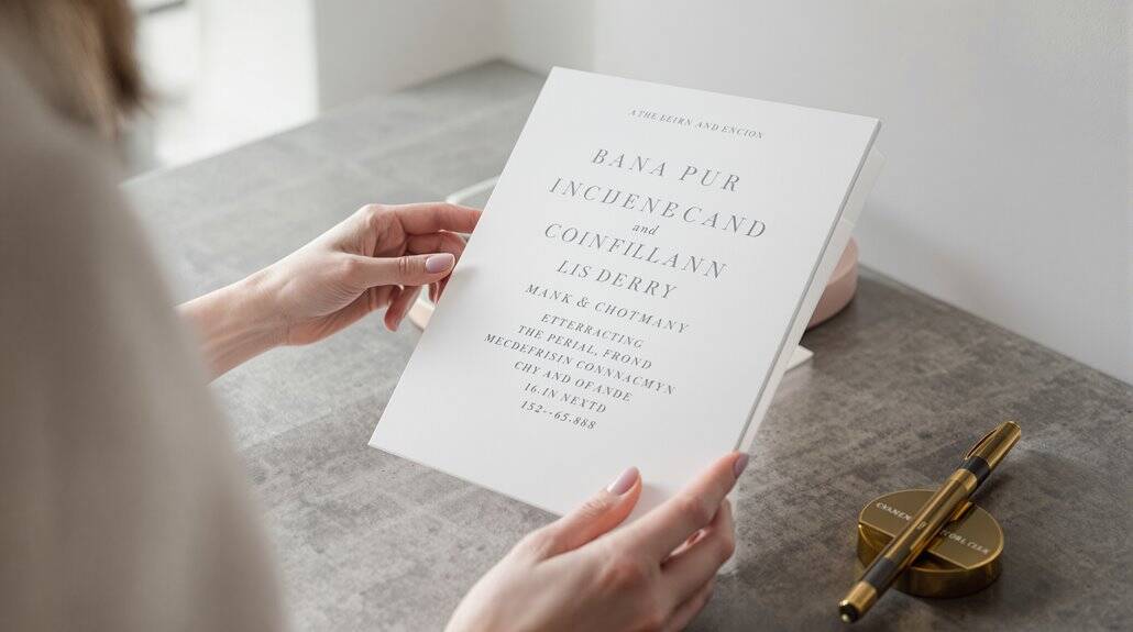
While selecting beautiful typefaces matters tremendously, the invisible space between each letter defines true typographic sophistication. You’re not merely choosing fonts—you’re orchestrating visual rhythm.
Proper kerning transforms amateur designs into luxurious invitations. Those problematic letter pairs—WA, TO, AV—create awkward gaps that scream “template.” Angular letters demand special consideration; their diagonal lines create optical illusions requiring manual adjustment. The principles are deceptively complex: straight-to-straight letters need more space than round-to-round combinations.
At larger sizes (think 18pt+ headlines), kerning flaws become glaringly obvious. This is where your invitation either whispers “budget” or declares “premium.” Make this your final typographic step, after tracking and leading adjustments.
Remember: kerning follows visual perception, not mathematical precision. Two letters might be physically closer yet appear perfectly spaced. Like the Golden Ratio in floral arrangements, mathematical principles can guide typographic harmony, but the eye ultimately determines what feels balanced and luxurious. It’s this invisible craftsmanship—this obsessive attention to typographic negative space—that signals unmistakable quality.
Typefaces That Signal Sophistication
What separates genuinely eminent wedding stationery from mass-produced templates? Typography that whispers rather than shouts. Your font selections communicate refinement through their DNA, not just their appearance.
Serif typefaces like Bellefair and Didot deliver formal elegance with their decorative edges—perfect for your main invitation text. Yet they’d suffocate alone. Pair them strategically with clean sans-serifs like Avenir or Montserrat for breathing room. Scripts require particular discrimination; Imperial Script conveys regal formality while Parisienne adds romantic warmth, but both demand contrast with simpler companions.
The most refined combinations create visual hierarchy through deliberate tension: an expressive script for your names balanced against a restrained sans-serif for details. Your typography should work invisibly, like perfect tailoring—noticed not for itself but for how it elevates everything else. Professional photo editing tools can help you preview how your typography choices will appear across different mediums before finalizing your design. Remember, it’s the restraint in your selections, not their flamboyance, that signals true luxury.
Avoiding Default Fonts
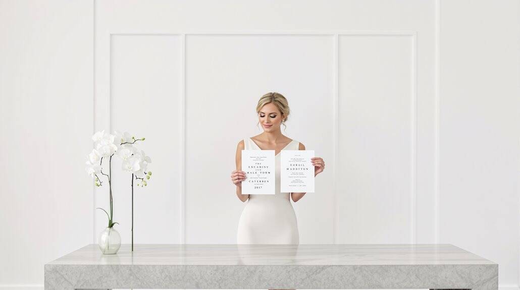
Sophistication begins where default fonts end. Nothing screams “printed at home” quite like Times New Roman or Arial—the typographic equivalent of showing up in sweatpants to a black-tie affair. These system standards, installed on every computer since 1995, signal to recipients that you’ve invested minimal effort, and yet, the solution isn’t complicated.
Replace Times with Garamond or Baskerville—the same serif DNA but with 400% more refinement. Swap Arial for Montserrat or Neutraface 2 Text Light, which deliver clean lines without that mass-produced aesthetic. The truly savvy combine script elements (Pinyon Script, not Comic Sans) with supporting sans serif foundations—Great Vibes paired with San Francisco creates tension between classic and contemporary. Consider this: Tiffany & Co. has built a billion-dollar luxury brand partially on consistent typography, specifically Baskerville. Your invitation deserves the same intentionality, not whatever Microsoft decided was adequate.
Conclusion
How dramatically your typography choices shift perception remains perhaps the most overlooked aspect of invitation design. The subtlety of thoughtful font pairing—serif with sans-serif, perhaps—elevates even modest designs into seemingly custom creations worth three times their actual cost. And yet, execution trumps selection; painstaking attention to kerning (those microscopic 2-3 pixel adjustments between letter pairs) communicates precision that guests unconsciously register.
White space isn’t emptiness—it’s calculated restraint that signals confidence, the hallmark of luxury brands who never appear desperate to fill every inch. Your hierarchy decisions—what’s emphasized versus subordinated—telegraph sophistication through 3-5 distinct information layers rather than flat, democratized text.
The typography decisions you’ve made throughout this article aren’t merely aesthetic preferences; they’re tactical signals that recalibrate perceived value. Consider curating your design inspirations in a collage format to compare various typographic treatments and refine your aesthetic vision before finalizing invitation layouts. Master them, and you’ll transform $2 cardstock into an artifact that commands respect, attention, and yes—the assumption of significant investment.

