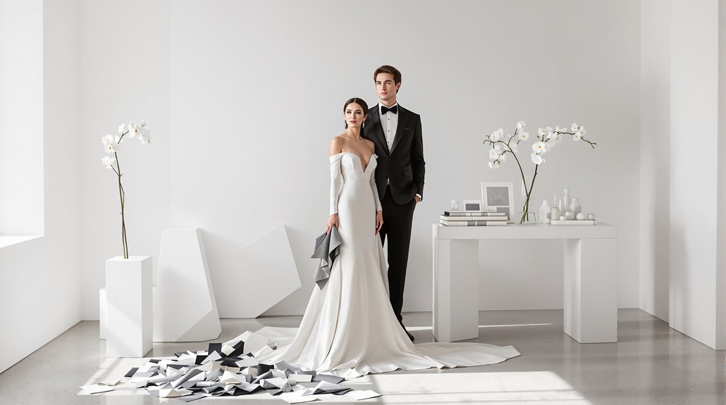
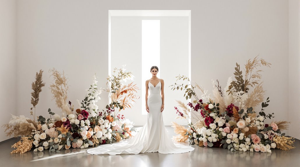
Your wedding doesn’t need a prescribed color palette—a recent invention dating back just 200 years. Instead, focus on material textures, tonal variation, and architectural elements that create depth without rainbow coordination. White dominated 41% of 2024 weddings, yet emerging trends show couples embracing personalized aesthetics through tactile elements—velvet, raw stone, weathered wood—rather than matching Pantone codes. The quiet luxury of a neutral foundation, punctuated with intentional details, photographs beautifully and allows sensory experiences to become the memory-makers.
The Wrong Question – Essay opening
When you sit down with your first wedding planner, they’ll inevitably lean forward, eyes bright with expectation, and ask, “So, what are your colors?” It’s the wrong question.
This fixation on predetermined color schemes is barely two centuries old—Queen Victoria’s 1840 white dress sparked a radical that somehow morphed into today’s obsession with coordinated napkins and boutonnieres. Before her, brides simply wore their finest clothing in whatever shade denoted their wealth. The neutral wedding palette isn’t radical; it’s historically accurate. In fact, quiet luxury emphasizes the significance of subtlety over vibrant hues, showcasing that elegance often lies in restraint.
What your celebration actually needs: texture, reflection, and quality of light. A no color wedding liberates you from the tyranny of matching, allowing materials themselves—polished silver, raw linen, weathered wood—to create visual harmony. And yet, the wedding industry relies on selling you the notion that without a distinct “palette,” your day lacks coherence. The ancient Egyptians and Romans understood that the symbolic power of wedding jewelry came from its circular form representing eternal commitment, not its matching color scheme. Consider instead what the Victorians understood intuitively—a wedding without theme feels more timeless than one constrained by transient color trends.
What Are Your Colors?: Industry Conditioning
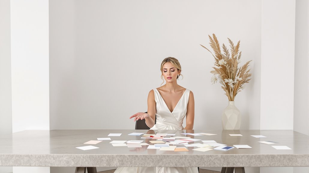
The wedding industry has conditioned you to believe your celebration requires a “color scheme” with the persistence of a drill sergeant. “What are your colors?” isn’t just an innocent question—it’s the foundation of an entire economic ecosystem designed to sell coordination.
Look at the data: white dominated 41% of 2024 weddings, with gold (36%) and ivory (32%) trailing closely behind. You’ve been subtly nudged toward this neutral wedding palette for decades, with vendor marketing reinforcing pastels and metallics as the “safe” refined wedding palette choices. And yet, these traditions are crumbling. The minimalist wedding colors you’ve been told represent elegance are simply artifacts of historical conditioning. In fact, emerging luxury trends indicate a significant shift in consumer preferences towards more personalized and diverse color choices.
Green now appears in 53% of weddings, with jewel tones reshaping luxury perception. Even Bridgerton-inspired aesthetics (up 191% year-over-year) and the “old money” trend (up 133%) reflect our collective shift away from prescribed color dogma toward textural, reflective design languages. This shift mirrors how younger couples, especially Gen Z proposers, are increasingly embracing both tradition and personalization in their engagement and wedding decisions.
Material Palette vs Color Palette
Despite what Pinterest boards might suggest, your wedding’s visual impact hinges not on perfectly color-matched elements but on the textural conversation between materials. Pursuing a wedding without a color theme isn’t abandoning aesthetics—it’s elevating them. Think metallic accents against wooden chargers, velvet ribbon wrapping linen napkins, candlelight dancing across crystal—these elements create depth no color-matched décor ever could.
Your neutral wedding palette becomes infinitely more refined when you prioritize the interplay of satin against crepe, or how silver candlesticks complement weathered farm tables. And yet, material selection isn’t random; it’s intentional curation based on sensory experience rather than RGB values. Seasonal considerations naturally guide these choices—fall’s dried botanicals, winter’s beaded satins, spring’s lush greenery—creating cohesion without color-matching tyranny. Additionally, the old money aesthetic embodies a timeless elegance that can further enhance your wedding’s material-driven design.
When coordinating vendors, give them material direction instead of Pantone numbers. Your neutral wedding design will breathe with authentic texture and dimension—qualities no color-obsessed Pinterest board can replicate.
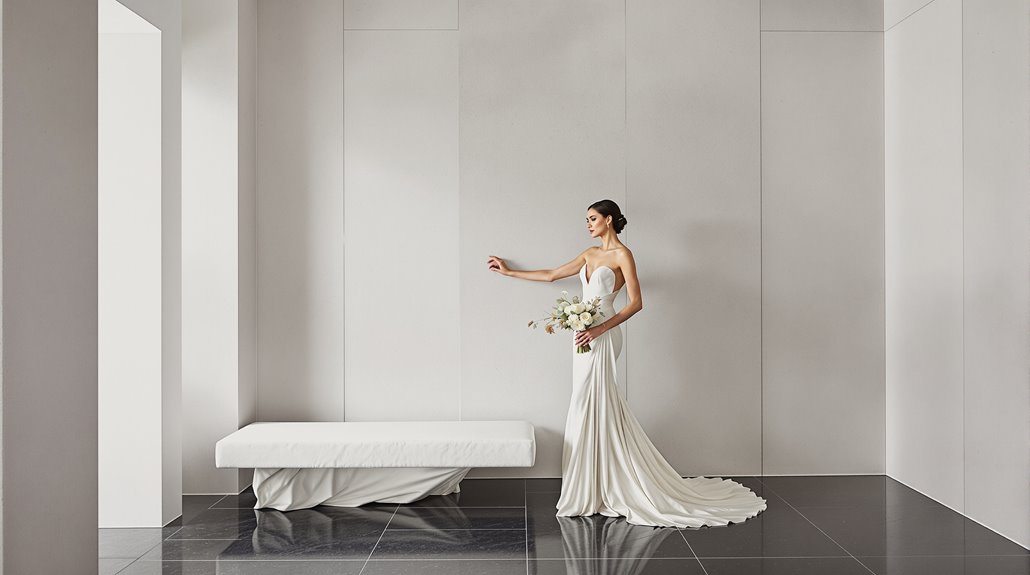
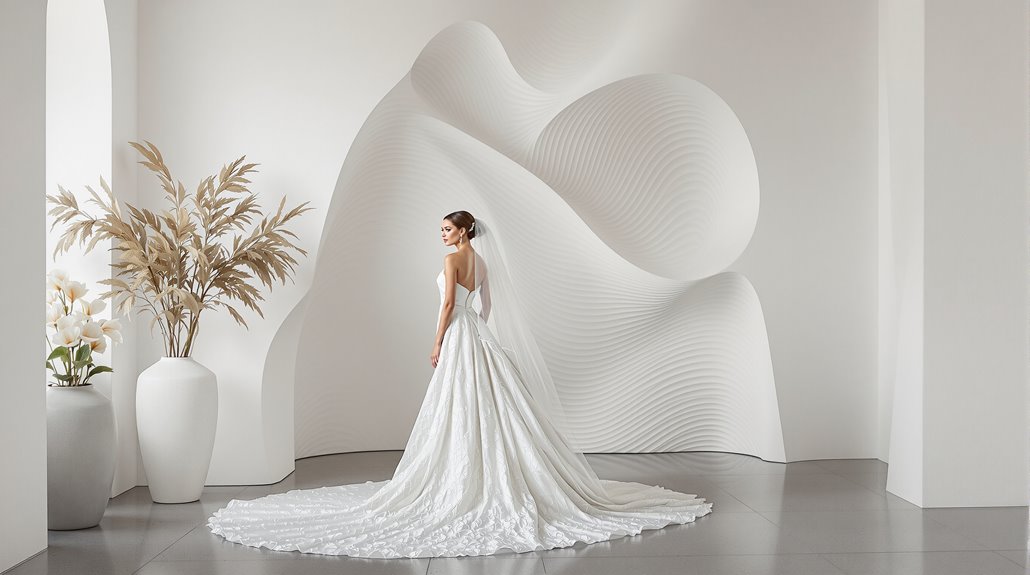
The Case for Tonal Variation: Ivory Cream Taupe Stone
Many discerning couples shy away from bold color statements only to discover that ivory, cream, taupe, and stone create a symphony more complex than any rainbow palette ever could. This neutral foundation establishes a timeless elegance that transcends seasons and venues—working equally well in July garden ceremonies or December ballroom receptions.
You’ll notice something extraordinary with this approach: architectural details suddenly become focal points rather than backdrops. Your carefully selected florals pop against taupe linens. The champagne accents catch light differently throughout your reception space—creating depth through seven or eight subtle gradations rather than three competing hues.
And yet, this restraint requires calculated accenting. A touch of black in table numbers, perhaps metallic elements in candleholders—these anchors prevent neutrals from floating into blandness. The psychological effect? Guests experience warmth and sophistication without visual competition, allowing your wedding’s emotional moments to command attention.
Texture as Sophistication
When couples obsess over wedding color palettes, they’re neglecting what actually separates pedestrian events from truly amplified ones—texture. You’re asking about forest green and blush? I’m asking about velvet, boucle, and hand-painted canvas that transforms ordinary spaces into sensory experiences worth your $8,000+ investment.
| Material | Visual Impact | Luxury Signal | Longevity | Photogenic Quality |
|---|---|---|---|---|
| Hand-painted Canvas | Visible brushstrokes create depth | Artisanal craftsmanship | Reusable across events | Remarkable in stills and video |
| Velvet Linens | Absorbs/reflects light beautifully | Immediate tactile luxury | Classic staying power | Creates natural dimension |
| Botanical Elements | Organic movement | Living luxury | Seasonal significance | Architectural interest |
| Raw Stone | Texture variation | Earth-connected elegance | Timeless material | Photographs with depth |
| Handwoven Textiles | Intricate detail work | Artisanal investment | Heirloom quality | Rich visual narrative |
The 2026 wedding scenery demands dimensional design choices that photograph consistently across both still and motion capture. Your tablescapes should feel touchable, not just viewable—because texture, not color, communicates sophistication.
How Neutral Palettes Create Depth
The obsession with lively wedding palettes overshadows a counterintuitive design truth—neutral foundations create the most dimensional celebrations. You’re actually limiting yourself by fixating on bold color statements when a canvas of whites, ivories, and taupes offers infinite textural possibilities.
Think about it: a monochromatic space forces you to play with reflection and light quality. Votives against stone walls. Blind-embossed invitations catching afternoon sun. Dried grasses introducing complex shadows against linen tablecloths. And yet, neutrals aren’t merely blank slates—they’re active participants in your design story, preventing visual chaos while enhance architectural details that would otherwise disappear.
Your venue becomes more adaptable too. That rustic barn or sleek hotel ballroom melds effortlessly with neutral frameworks, allowing your statement pieces—whether contemporary artwork or heirloom accessories—to command attention without competition. You’re not abandoning color; you’re elevating it by giving it purpose, context, and breathing room.
Examples: Weddings Without Color That Breathe
How exactly do minimalist color schemes translate into real-world celebrations? Look to the striking black-and-white monochromatic design that’s revolutionizing modern weddings. Bold streamers, candlesticks, and disco balls create dramatic visual impact without a rainbow palette—and yet the result feels more visually cohesive, not less.
Consider the timeless ivory approach: crystal chandeliers paired with all-white florals—roses, lilies, calla lilies—bathed in candlelight. It’s traditional, yes, but anything but boring when texture becomes the star.
The most persuasive colorless weddings introduce dimensionality through unexpected elements: dried flowers replacing traditional blooms, sequin shoes catching light beneath monochromatic gowns, wheat bouquets creating visual interest through natural texture rather than artificial color. Contemporary couples are embracing this polished constraint, discovering that limitations—paradoxically—unlock greater creative possibilities. Disco balls alongside custom jackets, modern stationery against Bridgerton-inspired backdrops—these juxtapositions create refined tension impossible within the tyranny of matching color schemes.
When Color Is Needed vs When It’s Not
| Scenario | Color Needed | Material Focus Better |
|---|---|---|
| Historic venue with ornate details | Minimal—let architecture speak | Textures that complement existing elements |
| Outdoor garden setting | Strategic pops against natural backdrop | Reflective materials capturing natural light |
| Industrial warehouse space | Color to warm stark environment | Raw materials that enhance spatial character |
You’re creating a sensory experience, not a paint swatch collection. When your venue already offers visual richness, pivot to material selection—think luminosity, texture, and reflection. And yet, when spaces feel stark or impersonal, thoughtful color infusion transforms them completely. Your question isn’t whether to use color, but rather: what sensory elements will create the atmosphere you’re seeking?
Conclusion
Redefining wedding design means shedding outdated color-matching obsessions in favor of what truly strikes a chord. Your guests won’t remember whether your napkins perfectly matched your bridesmaids’ dresses—they’ll remember how the evening light filtered through bistro bulbs as conversation flowed freely, how texture and materiality created depth that flat color schemes never could. And yet, this isn’t permission for visual chaos; it’s an invitation to thoughtful curation beyond the color wheel.
Consider materials first—velvet, silk, weathered wood, hammered brass—then watch as a natural palette emerges, one that feels both intentional and effortlessly cohesive. Your wedding deserves this liberation from Pinterest-perfect color coordination, this freedom to breathe and evolve organically. The most refined celebrations, after all, aren’t built on predetermined swatches but on sensory experiences that unfold moment by moment. Trust that ambiance, not aesthetics, creates the memories worth keeping.