Monochromatic palettes showcase varying shades of a single hue—creating subtle, elegant refinement through texture and tonal depth. Complementary schemes, using opposite wheel colors, deliver bold visual tension and energetic statements. You’ll want monochrome for understated polish, especially in architecturally significant venues; choose complementary for dramatic impact and emotional intensity. Your decision hinges on venue constraints, personal style, and the emotional narrative you’re crafting. The right palette doesn’t just decorate—it articulates your story without speaking a word.
Two Paths to Cohesion
While planning your wedding aesthetic might seem like a dizzying labyrinth of design decisions, the most successful palettes eventually follow one of two distinct approaches—and neither is accidental.
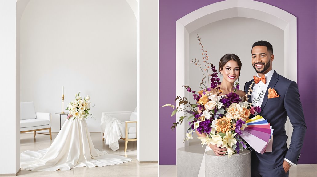
The monochrome wedding design path embraces sophistication through restraint, washing your celebration in variations of a single hue—ivory melting into champagne into gold—creating visual clarity that feels both enveloping and psychologically consistent. You’re not limited to flat sameness; the magic lives in texture variations and playing across a wide chroma range within your chosen color. Adding metallic accents like silver or gold can elevate a monochromatic scheme to new heights of elegance. The choice of quality over quantity is essential in ensuring that each element contributes to an overall sense of understated luxury.
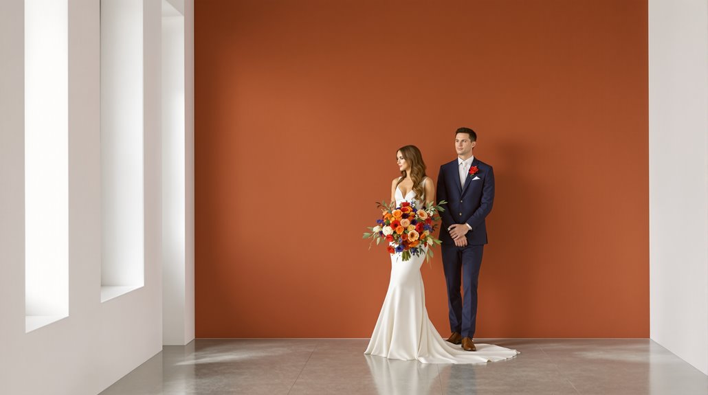
Alternatively, complementary wedding palette types utilize deliberate contrast—navy and copper, burgundy and sage—following the precise 60-30-10 proportion formula that prevents visual chaos. These opposites-attract pairings amplify energy while developing structural dimension through their interaction.
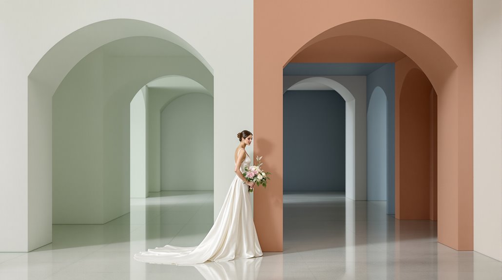
Between these wedding color palette types sits the analogous approach, using adjacent wheel colors to create soothing gradients and transitional bridges—but that’s another conversation entirely. What matters is intention, not accident.
Monochromatic Defined – Single hue variations
Unlike most trends that crash into wedding seasons with temporary fanfare, monochromatic color schemes represent one of the most enduring approaches in design sophistication. They’re deceptively simple—just one base color extended through its various shades and tints—and yet this restraint creates a visual cohesion that screams intentional elegance. Your palette isn’t limited to five identical swatches; it breathes through 3-7 distinct variations of your chosen hue. This method can enhance your budget by allowing for spending optimization in other areas of your wedding design.
The magic happens when you understand these four fundamental components:
- Base color: Your anchor shade—the purest expression of your chosen hue
- Tints: Lighter variations created by adding white to your base
- Shades: Darker expressions achieved by incorporating black
- Tones: Subtle nuances developed by blending gray with your base
Single hue variations don’t mean monotony—they create depth. The restraint you exercise in color selection paradoxically expands your design’s visual richness, creating a layered experience that feels both cohesive and nuanced. This approach often creates a sense of calm for designers and clients alike, making the entire planning process more serene and focused.
Complementary Defined – Contrasting colors
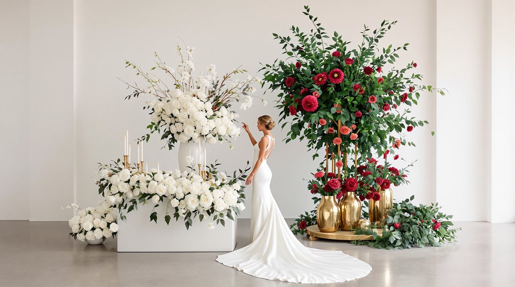
If monochromatic palettes represent polished restraint, complementary color schemes embrace deliberate tension as their defining strength. You’ll find complementary colors directly opposite each other on the color wheel—think blue and orange, red and green, or purple and yellow. When placed side-by-side, these contrasting wedding colors create an electric visual impact that’s impossible to ignore.
The science behind this? It’s called the “law of simultaneous contrast,” where opposing hues actually intensify each other’s vibrancy when juxtaposed. Your navy and copper reception will pop with refined drama; your emerald and burgundy tablescapes will command attention without trying.
But here’s the essential distinction: while monochromatic palettes whisper elegance through restraint, complementary schemes announce themselves through calculated opposition. You’re not just selecting pretty colors—you’re leveraging a fundamental visual principle that creates energetic movement across your wedding space, balancing one warm tone against one cool in perfect, intentional tension. Additionally, understanding emerging luxury trends can help you choose complementary colors that resonate with contemporary aesthetics.
When Monochromatic Works Best
Monochromatic color schemes shine brightest when simplicity must carry sophistication. You’ll find single color wedding approaches particularly effective when your venue already possesses distinctive architectural elements or natural beauty that shouldn’t compete with your décor. The planning efficiency gained from committing to one color family—rather than juggling complementary hues—allows you to focus intensely on texture, material, and lighting variations.
The power of monochromatic design lies in its ability to elevate simplicity into refined elegance through textural depth rather than color competition.
Your wedding color palette type selection should lean monochromatic when:
- You’re planning in limited timeframes (under 6 months) and need decisive, streamlined choices
- The event requires visual continuity across multiple spaces or challenging transitions
- Your budget prioritizes quality over quantity in décor elements
- You’re drawn to timeless elegance rather than trendy, potentially dated combinations
This approach creates depth through tonal variations—ivory, champagne, warm gold—rather than contrasting colors, delivering a refined aesthetic that appears meticulously curated, not accidentally assembled.
When Complementary Creates Impact
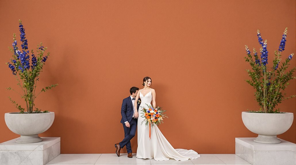
Complementary color schemes thrive where boldness becomes your tactical advantage. When you’re crafting a wedding palette that demands attention—not just admiration—positioning opposites on the color wheel (blue and orange, red and green) creates that electric visual tension your monochromatic wedding simply cannot. The psychology is unmistakable: complementary combinations evoke heightened emotional responses through their inherent opposition, making each design choice feel deliberate, each photograph pop with intentionality.
You’ll find complementary wedding color palette types work magnificently in specific contexts—summer celebrations with coral against sky blue, fall ceremonies with burgundy and gold, beach gatherings where aqua meets warm coral. The secret? Structure your palette with two primary colors, 1-2 secondary hues, and 1-2 *tactical* accents. Balance is everything; complementary doesn’t mean chaotic. And yet, this approach demands confidence—a willingness to abandon the safe harbor of one-color wedding schemes for the striking impact of thoughtful contrast.
Venue Considerations
Your chosen venue silently dictates which palette type will transform or flounder within its walls, making assessment non-negotiable before committing to either approach. That historic ballroom with its burnished gold moldings practically begs for the restraint of a monochromatic scheme—navy or burgundy perhaps—while contemporary spaces with clean lines invite bold complementary experiments. You’ll discover this truth within minutes of your first site visit.
Consider these non-negotiables when matching venue to palette:
- Natural lighting conditions—candlelit receptions elevate monochromatic schemes while washing out vibrant contrasts
- Existing architectural elements—rustic barns embrace earthy tones while beach settings demand oceanic blues paired with sandy neutrals
- Seasonal surroundings—spring gardens require colors that complement rather than compete with nature’s own palette
- Venue restrictions—some locations limit decorative modifications, narrowing your implementation options dramatically
The venue isn’t just a backdrop—it’s your palette’s home, determining whether sophistication or liveliness will prevail.
Sophistication vs Drama
While pursuing visual harmony for your celebration, the fundamental choice between elegance and drama defines not just your color story but your entire aesthetic narrative. Monochromatic schemes—those ivory-to-champagne progressions or graduated blues—whisper rather than shout, creating visual cohesion through restraint. You’re choosing the path of subtle distinction.
Complementary palettes, by contrast, demand attention. They’re visual exclamation points, creating energy through deliberate tension—navy against copper, plum against sage. And yet, their success hinges on execution.
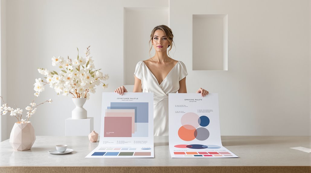
| Palette Type | Visual Impact | Emotional Response |
|---|---|---|
| Monochromatic | Subtle, flowing, unified | Calming, refined, elegant |
| Complementary | Bold, striking, lively | Energetic, memorable, stimulating |
| Desaturated Complementary | Elegant tension, balanced | Intriguing, nuanced, timeless |
The wisdom lies in alignment: dramatic personalities deserve dramatic palettes. If you’re drawn to understatement, monochromatic approaches honor that instinct. Your palette should feel like breathing—natural, inevitable, yours.
Design Confidence Required
The learning curve between palette types represents a hidden consideration few wedding guides address head-on. Monochromatic schemes—those elegant variations of a single hue—often require more technical finesse than their complementary counterparts. The subtlety lies in nuance rather than contrast.
Your design confidence should factor heavily into this decision:
- Monochromatic requires precision in shade selection—too similar and everything blends; too varied and cohesion dissolves
- Complementary palettes forgive minor mistakes through intentional contrast
- Single-hue approaches demand exquisite lighting consideration (what looks ivory indoors might wash yellow outside)
- Textural variety becomes essential in monochromatic designs to prevent visual flatness
You’ll face an interesting paradox: monochromatic schemes appear deceptively simple—just one color!—and yet their execution demands a refined eye for subtlety. Complementary colors create immediate visual interest, but require careful curation to avoid carnival-like overstatement. Your personal comfort with color theory should guide this choice.
Decision Framework
Choosing between monochromatic and complementary palettes demands a structured approach rather than mere aesthetic preference. Consider first your venue’s existing features—neutral spaces accommodate either option, while distinctive settings may already point you toward harmony or intentional contrast.
The deliberate choice of palette transcends preference—it’s a dialogue between your vision and your venue’s inherent character.
Your aesthetic confidence level matters tremendously. Monochromatic schemes (think ivory-to-champagne-to-gold progressions) require finesse with subtle variations—safe for minimalists, challenging for the detail-obsessed. Complementary palettes like navy-and-copper demand decisive color blocking and balance—exciting but potentially chaotic without careful execution.
The sophistication equation works both ways. Monochromatic reads as restrained elegance, a whispered luxury that feels eternally timeless and yet requires painstaking curation to avoid blandness. Complementary combinations deliver impact, visual energy, memorable statements—and yet they risk feeling trendy if not anchored in personal meaning.
Your palette isn’t just pretty colors; it’s your event’s visual language. Choose according to the conversation you want your wedding to have with guests.
Conclusion
Whether you’ve deliberated thoroughly or followed your instinctive preferences, your palette decision fundamentally shapes your wedding’s visual narrative. The choice between monochromatic sophistication and complementary dynamism isn’t merely aesthetic—it’s psychological, creating the emotional foundation guests experience throughout your celebration. Your palette becomes the silent language of your union.
Consider these final reflections as you decide:
- Monochromatic schemes offer elegant restraint, while complementary palettes create deliberate visual tension—both valid expressions of your partnership’s unique character
- Seasonal context matters profoundly—summer’s brightness tolerates bold complementary choices that winter’s subdued light might diminish
- Personal narrative trumps trends every time—choose colors that tell your story, not someone else’s
- Execution quality ultimately determines success—a masterfully implemented monochromatic scheme outshines a poorly executed complementary one
Trust your instincts. Your palette should feel like coming home—familiar yet still capable of taking your breath away.