True letterpress isn’t just about the label. Look for consistent impression depth (0.2-0.3mm), perfect registration (misalignment under 0.2mm), and appropriate pressure that creates tactile depth without fiber damage. Quality work shows even ink coverage (1.7-2.0 densitometer readings) and crisp edges. Use your fingertips, not just your eyes—exceptional letterpress balances technical precision with artistic restraint. The difference between trendy imitation and genuine craftsmanship becomes obvious once you understand the telltale markers.
Letterpress as Marketing Term

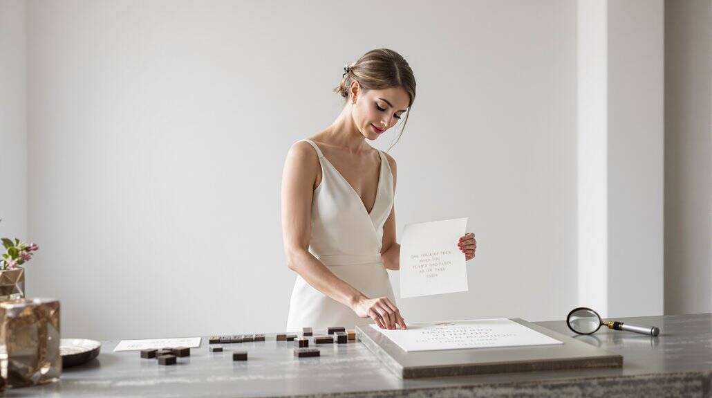
Why has “letterpress” transformed from a technical printing process into a buzzword plastered across luxury stationery and wedding invitations? Simple economics meets consumer psychology. When digital printing became ubiquitous, letterpress—that centuries-old technique requiring specialized equipment and expertise—evolved into shorthand for “premium.” And yet, not all letterpress products deserve their inflated price tags.
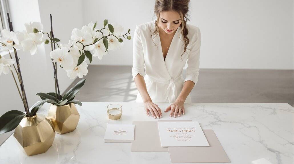
To properly evaluate letterpress printing, you’ll need more than marketing promises. Authentic letterpress quality markers include consistent impression depth throughout the piece—not too shallow (barely visible) nor too deep (punching through paper). Registration must be perfect; colors should align with precision within 0.2mm. The pressure applied reveals craftsmanship—enough to create that coveted tactile experience without distorting the paper’s reverse side. Traditional letterpress utilized paste inks with specific viscosity requirements that contributed to its distinctive appearance. Many items marketed as “letterpress” fail these basic assessments, delivering merely the aesthetic without the artisanship. The difference? About eight hours of setup time and decades of technical knowledge. Just as fabric weight influences whether a wedding table appears polished or makeshift, paper specifications shape whether your invitation feels curated or mass-produced.
Quality Marker 1: Even Impression Depth
When examining letterpress work, nothing reveals mastery quite like consistent impression depth across the entire printed surface. You’ll spot amateur efforts immediately—uneven inking, heavier impressions in some areas, barely-there in others. This isn’t accidental; it’s the telltale signature of poor press calibration.
A professional’s work shows scrupulous attention to pressure management. They’ve leveled their platen perfectly, aligned their rollers in strict parallel, and balanced force distribution across the entire forme. And yet, achieving this consistency requires more than mechanical precision—it’s about harmony between materials. Your packing systems make all the difference here: hard packing concentrates impression force evenly, while proper moisture content in high-rag papers allows depth without damaging reverse sides. Professional printers adjust the impression roll to achieve a kiss touch that creates the ideal depth without excessive force.
Look closely at large solid areas—they should maintain identical depth from edge to edge. This isn’t merely aesthetic perfectionism; it’s evidence of calibration mastery that separates genuine craftspeople from dabblers. Much like haute couture demands precision in every detail, letterpress printing requires the same unwavering commitment to technical excellence.
Quality Marker 2: Perfect Registration No Misalignment
Perfect registration stands as the supreme litmus test for true letterpress craftsmanship—few technical demands expose amateur work faster than misaligned colors. When evaluating letterpress quality, scrutinize how precisely each color aligns with others, revealing whether you’re holding mass-produced merchandise or genuine artisanship. Registration accuracy demands exceptional precision across multiple press runs, with paper repositioned identically for each color.
Look for these telltale signs of masterful registration:
- Color boundaries that meet perfectly without gaps or overlaps
- Text that maintains crisp edges without fuzzy halos or doubling
- Fine details under 0.25 points remaining sharp and distinct
- Consistent alignment maintained throughout the entire print run
Equipment limitations make perfect registration incredibly difficult—Heidelberg Windmills can achieve it but require large margins; L Letterpress machines simply can’t due to loose hinges. And yet, the best printers overcome these constraints through careful technique and appropriate design choices. Bella Figura achieves this level of precision through their use of vintage presses combined with traditional printing methods that honor time-tested craftsmanship.
Quality Marker 3: Appropriate Pressure Felt Not Crushed
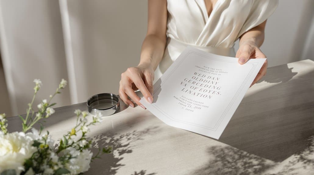
The hallmark of exceptional letterpress printing lies not in crushing paper into submission, but in applying precisely calibrated pressure—an art form requiring masterful restraint. You’ll recognize superior work by running your fingers across impressions that create tactile depth without compromising paper integrity.
When examining letterpress pieces, look for impressions deep enough to feel—perhaps 0.2-0.3mm—but not so aggressive they’ve fractured fibers or punctured the reverse side. Quality printers adapt their technique to each stock; Mohawk Superfine responds differently than textured alternatives, requiring distinct pressure protocols.
Subpar presswork betrays itself through splotchy impressions, bloated edges, or fiber collapse—signs of equipment mismanagement or inexperience. The finest letterpress creates a dance between weight and restraint—the impression depth precisely calibrated to preserve structural integrity while delivering that unmistakable dimensional quality you’re seeking. It’s felt, not crushed; present, not dominating. Just as florists use visual references to bridge communication gaps with clients who lack technical vocabulary, examining physical samples helps you articulate your letterpress preferences beyond industry jargon.
Quality Marker 4: Ink Opacity and Coverage
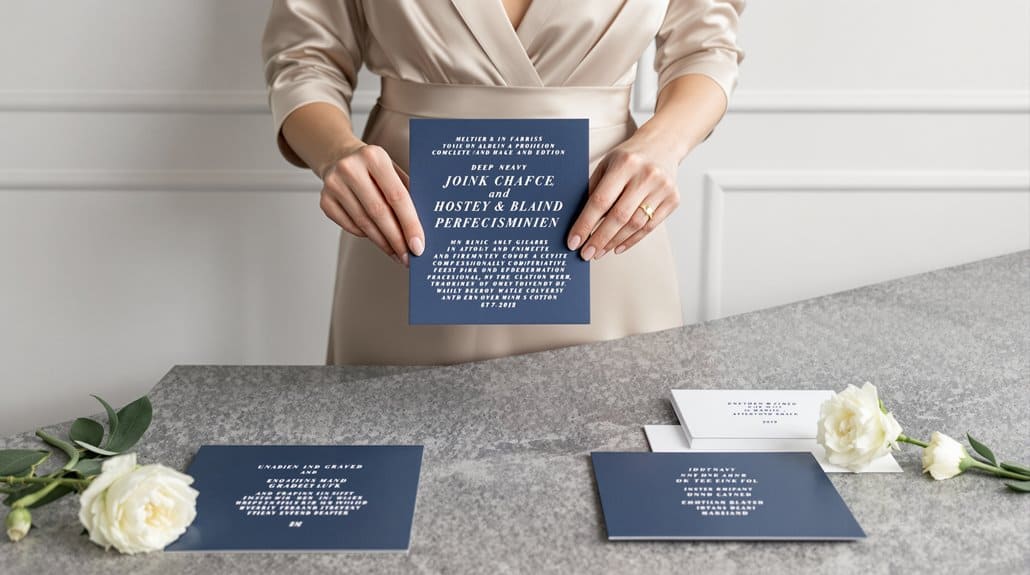
How well does your letterpress piece hold its color? True letterpress excellence demands masterful ink opacity and coverage quality—that perfect balance between pigment and vehicle that transforms ordinary printing into something magnificent. You’ll notice remarkable letterpress printers obsess over paper interaction, testing inks on actual stock rather than trusting theoretical color matching.
When examining a letterpress piece, look for:
- Even color density across the entire printed area—no patchy, inconsistent coverage
- Crisp color boundaries where ink sits precisely where intended, not bleeding beyond
- Vibrant hues that maintain their integrity even on off-white stocks
- Appropriate transparency where intentional, opacity where required
Opaque inks produce bolder, more poster-like results, while transparent formulations create delicate, luminous effects. And yet, neither approach is inherently superior—the hallmark of quality is whether the printer chose the right opacity for your specific design and substrate. Much like how interior design strategies emphasize selecting the right visual elements to create desired effects in spaces, choosing the appropriate ink formulation determines whether your letterpress work achieves its intended aesthetic impact.
Questions to Ask Letterpress Printers
When selecting a letterpress printer for your cherished project, careful interrogation separates true craftspeople from marketing-savvy pretenders. Ask about their impression depth protocol—do they calibrate pressure specifically for your chosen paper weight? Demand evidence. Request to see registration marks from previous projects; quality letterpress work shows perfect alignment without misalignment exceeding 0.2mm.
Inquire about their ink density measurement system. Serious printers use densitometers to ensure 1.7-2.0 readings across all printed areas, not eyeballing it. And yet, numbers alone can’t capture artistry—ask to feel their portfolio pieces. The tactile quality of letterpress printing assessment requires fingertips, not just eyes.
Don’t shy from asking about their error correction policy. Good letterpress printing isn’t about never making mistakes—it’s about refusing to accept them. A worthy printer will discard entire runs rather than deliver mediocrity, absorbing costs that would make accountants wince. Just as luxury skincare and makeup requires attention to detail for a flawless bridal look, premium letterpress demands the same uncompromising standards.
When Letterpress Worth Premium vs Trendy Method
Deciding whether letterpress justifies its premium isn’t merely subjective preference—it’s tactical calculation. The true value emerges when you’re targeting audiences who’ll appreciate letterpress quality beyond the surface-level “handcrafted” marketing buzz. To evaluate letterpress as investment rather than indulgence, consider these factors:
- Volume economics — Projects under 500 units make letterpress competitive; anything more and digital printing wins the cost battle
- Brand alignment — Legal firms, luxury brands, and boutique businesses utilize the tactile experience as brand reinforcement
- Design compatibility — Typography-forward, bold linework designs optimize letterpress’s strengths while minimizing its limitations
- Audience perception — Recipients must recognize and value the craftsmanship, otherwise you’re paying premium for unappreciated quality
The letterpress printing assessment ultimately hinges on whether the medium itself communicates your message. When the physical impression creates emotional impression, it’s worth every penny. Wedding invitations particularly benefit from this approach, as modern wedding etiquette increasingly values personal, thoughtful touches over mass-produced formality. When it’s merely trendy—it’s wasteful extravagance.
Conclusion
What separates genuine letterpress mastery from mere technical execution? True craftsmanship reveals itself in perfect registration—where multiple colors align with microscopic precision—and consistent impression depth that whispers rather than shouts. You’re not just buying printing; you’re investing in meticulous attention that transforms paper into tactile art.
| Quality Marker | Novice Work | Expert Execution |
|---|---|---|
| Impression | Inconsistent, often too deep | Even, intentional depth |
| Registration | Misaligned elements | Perfect alignment |
| Ink Coverage | Patchy, uneven | Smooth, consistent |
| Paper Response | Generic stock, unresponsive | Carefully selected, complementary |
When evaluating letterpress work, trust your fingertips as much as your eyes. The finest pieces balance technical precision with artistic restraint—deep enough to feel but never crushing the fibers. And yet, the most compelling letterpress often breaks rules deliberately, creating controlled imperfections that showcase the human touch behind the mechanical process. Just as meaningful symbols in jewelry design elevate personal significance, exceptional letterpress work becomes more than a printed piece—it transforms into a cherished keepsake that tells your unique story.