To design invitations that match your venue’s architecture, extract 2-3 defining elements from the space—perhaps that grand staircase or distinctive stained glass—and incorporate them as subtle motifs. Your paper choice matters enormously; heavyweight cotton for estates, clear acrylic for museums, metallic accents for industrial spaces. Typography should echo the venue’s character: serif fonts for classical buildings, sans-serif for modern structures. The invitation isn’t just pretty paper—it’s a visual promise of what awaits beyond those venue doors.
Invitation as Venue Foreshadowing
When your guests first glimpse your invitation, they’re not just learning when and where to show up—they’re receiving their first sensory impression of the entire wedding experience. This single piece of paper (or luxurious cardstock, rather) must foreshadow the architectural splendor awaiting them.
Your invitation design venue style creates an unspoken promise—one you’ll fulfill when guests arrive. Consider incorporating watercolor renderings of your venue’s most striking features: the grand staircase, stained glass windows, or centuries-old oak trees. And yet, subtlety matters. The invitation venue connection works best through suggestion, not literal reproduction—perhaps through color palettes that echo your location’s natural surroundings or typography that mimics architectural periods. Many designers enhance wedding invitation elegance by incorporating gold foil accents that complement the venue’s luxurious elements.
For maximum impact, extend your venue’s visual narrative across your entire stationery suite. RSVP cards, envelope liners, and detail inserts become chapters in the same captivating story. Drawing inspiration from luxury cosmetics packaging, the finest invitation designs balance opulence with restraint, creating an unforgettable first impression.
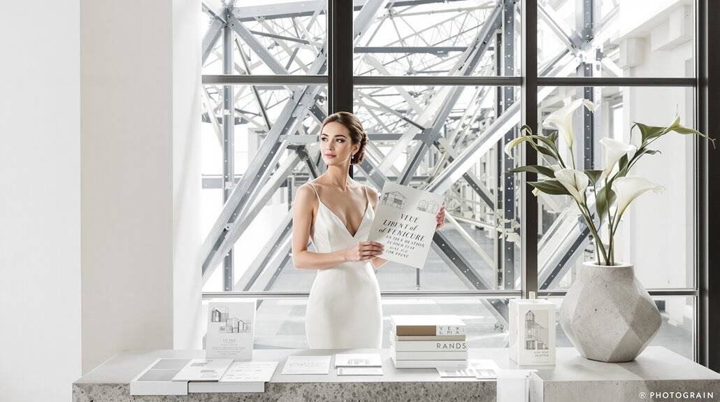
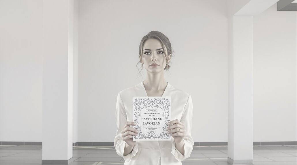
Museum Wedding Invitations: Clean Modern Typography
Within the pristine walls of a museum venue, where curated masterpieces and architectural precision reign, your invitation must serve as a gallery-worthy piece that commands the same reverence as its surroundings. The invitation-venue connection demands clear acrylic substrates—transparent canvases for minimalist type treatments and deliberate negative space.
You’ll find gold foil stamping creates stunning contrast against clean typography, but choose your finish carefully—matte often preserves legibility while maintaining sophistication. Pair these elements with watercolor venue illustrations in soft blush or cream tones, creating a cohesive invitation design that telegraphs the museum experience before guests even arrive. The Brooklyn Museum wedding invitation successfully incorporated acrylic watercolor imagery as the primary visual theme to highlight the museum’s signature aesthetic.
Selective calligraphy—perhaps just for names or dates—introduces artisanal warmth to an otherwise structured aesthetic. Choose 2-3 hues that harmonize with your museum’s existing tones, using dominant tones with subtle accents to create visual rhythm that echoes the emotional character of the space. The invitation-venue aesthetic harmony matters tremendously; your paper suite should mirror the museum’s curated sensibility through limited color palettes (two or three colors maximum) and purposeful material selection. This isn’t merely stationery—it’s your first exhibited work.
Estate Wedding Invitations: Classical Layout
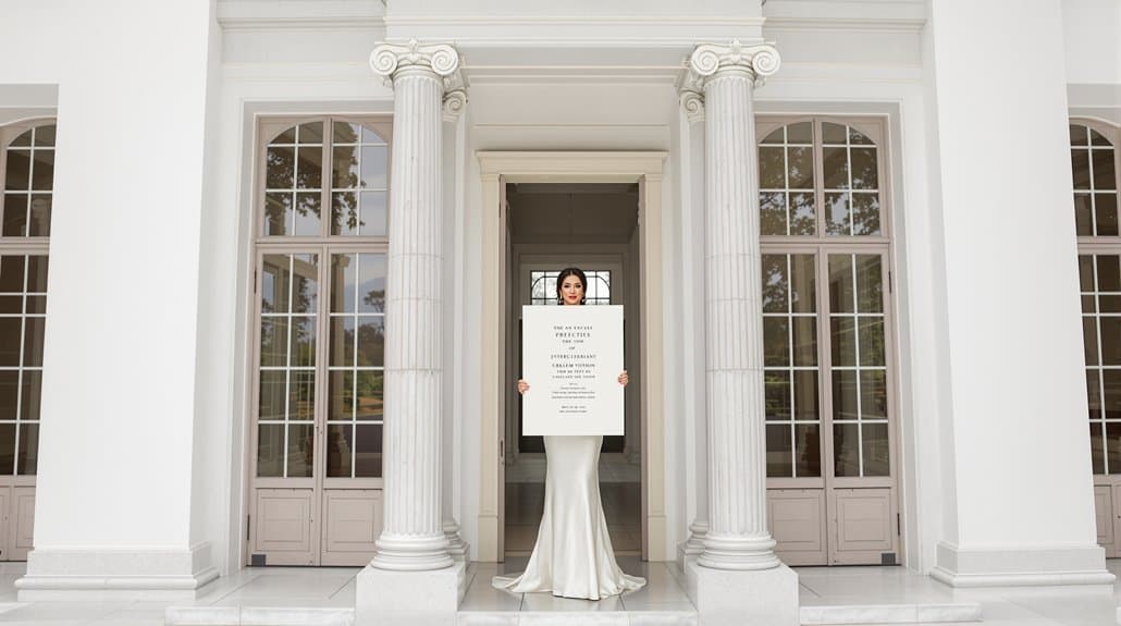
The grandeur of an estate venue demands invitation stationery that speaks in hushed tones of old-world refinement and architectural permanence. Your paper choice forms the foundation—opt for heavyweight cotton or linen card stock with optional deckled edges that telegraph quality the moment guests touch the envelope.
Center your text symmetrically, allowing balanced white space to frame content without crowding. This invitation-venue connection isn’t merely aesthetic; it’s psychological preparation. Pair a polished serif font with delicate script calligraphy—perhaps hand-written names atop machine-printed details—creating visual hierarchy that mirrors the estate’s ordered elegance.
Color schemes should whisper rather than shout: cream bases with gold foiling, champagne with black letterpress, or classic navy with silver accents. Monograms and subtle motifs improve without overwhelming. For materials that embody these principles, consider Crane & Co. cotton paper, which brings exceptional quality and texture to formal invitations. The perfect invitation design venue style achieves the seemingly impossible: feeling both timeless and deeply personal, elegant yet warmly inviting—precisely like the estate itself.
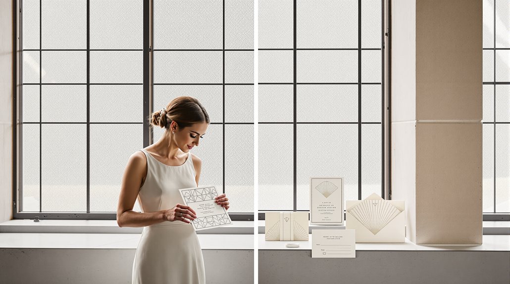
Industrial Space Invitations: Bold Graphic Approach
Raw, industrial venues demand invitations that embrace architectural honesty through deliberate design choices—and yours should telegraph the experience awaiting guests. Your invitation’s design establishes the venue’s personality before anyone crosses the threshold. Letterpress black ink on ivory paper creates dimensional contrast, while metallic gold on black delivers reflective drama. The invitation match venue principle extends beyond color to structural elements—geometric patterns and angular borders mirror exposed beams and concrete.
Your industrial venue deserves an invitation that speaks its language—raw materials, bold typography, and architectural precision that previews the experience to come.
For perfect invitation-venue connection, prioritize:
- Typography that means business—sans-serif and geometric typefaces rather than flowery script
- Materials with substance—acrylic bases, vellum overlays, or metallic accents that reflect industrial textures
- Restrained embellishment—a gold wax seal adds sophistication without undermining the stark aesthetic
When working with industrial venues that feature structural elements like exposed beams and original rigging points, ensure your design choices acknowledge both the raw aesthetic and the architectural limitations that make these spaces unique. This bold graphic approach celebrates industrial spaces’ architectural honesty while promising guests an experience that’s deliberately designed, not accidentally assembled.
Creating Journey From Mail to Space
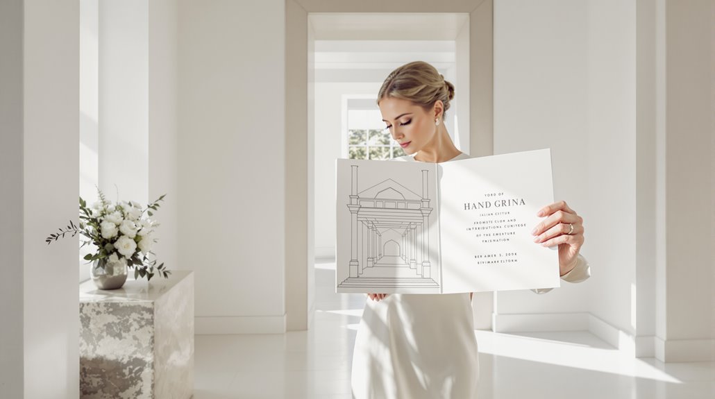
As guests retrieve your invitation from their mailbox, they’ve already begun a journey toward your celebration—one that should deliberately preview the architectural experience awaiting them. Your invitation design venue style establishes expectations that will materialize when they arrive at your chosen location.
Consider incorporating custom illustrations of your venue’s facade—a hand-drawn architectural rendering transforms a simple invitation into a visual wayfinding tool. To coordinate invitation venue aesthetics, extract ornamental details from the space itself: floor patterns, stained glass motifs, or structural elements translated through blind impression techniques. This invitation-venue connection creates powerful recognition when guests finally enter the space.
Materials matter tremendously. Letterpress on heavyweight stock for a historic estate; clean metallic foil for contemporary museums. Your color palette should reference—never compete with—the venue’s scheme, creating a seamless visual journey from paper to physical space, mailbox to monument. Should your venue information link become broken or incorrect, maintain backup digital copies with alternative navigation options to ensure guests can still locate your celebration space.
Design Cohesion Principles
Effective design cohesion demands that every visual element communicate a singular, unified message from the moment your invitation arrives to the final farewell. Your stationery serves as the visual contract between expectation and experience—a promise your venue must fulfill. When designing for architectural harmony, you’re establishing a visual language that connects paper to place.
Most couples overlook three critical alignment principles:
- Typography hierarchy – Museum venues require clean, sans-serif modernism; estates demand classical serifs with appropriate weight distribution
- Color palette extraction – Pull 2-3 dominant architectural colors plus 1 accent from your venue’s distinctive features
- Spatial echoing – Replicate your venue’s negative space ratios within your invitation’s margins and layout grid
Your invitation isn’t merely information—it’s architectural foreshadowing. The way text breathes on the page should mirror how bodies will move through your chosen space. When planning a Metropolitan Museum wedding, consider how the institution’s neoclassical grandeur and gallery proportions should inform both your invitation’s scale and visual sophistication. And yet, this cohesion can’t feel calculated; it must appear effortless, as though the paper naturally belongs to the place.
Avoiding Aesthetic Disconnect
Despite your best intentions, the most jarring invitation mistake occurs when guests walk into your venue and experience visual whiplash—the promised aesthetic nowhere to be found. You’ve fundamentally written a visual check your venue can’t cash. This disconnect undermines guests’ entire experience.
Your invitation makes a visual promise your venue must keep, or risk disappointing every guest who walks through the door.
Scrutinize your venue’s authentic personality—not what you wish it were. That oceanside venue with weathered wood and nautical charm? Don’t pair it with glitzy gold foil and art deco typography, no matter how much you adore Gatsby. Your modern museum wedding demands clean lines and minimalist design, not ornate scrollwork better suited to ballrooms. If you’re planning a North Carolina mountain celebration, incorporate the region’s natural elements—such as native flora, stone textures, or woodland motifs—to authentically represent the landscape your guests will experience.
Consider seasonal context, too. A December invitation featuring lush green gardens sets false expectations when guests arrive to bare branches and holiday décor. Instead, incorporate winter elements—berries, evergreens—into your custom venue sketch.
Remember: your invitation isn’t just pretty paper—it’s the opening chapter in your wedding’s visual story. Make it truthful.
Conclusion
Your invitation tells the truth—or it doesn’t. When an embossed, gold-foiled invitation arrives promising elegance, yet guests encounter plastic tablecloths and cash bars, the disconnect is jarring, even offensive. You’re making a visual contract with attendees—one that should honor their expectations and your venue‘s inherent character. This isn’t about perfection but integrity in design.
Consider these non-negotiables when aligning invitation design with venue architecture:
- Study your venue’s core elements – identify 3-5 architectural features worth translating to paper
- Establish priority hierarchy – determine which design element matters most: typography, color palette, or structural details
- Test your design against venue photos – place invitation mock-ups alongside venue imagery to check cohesion
The most successful celebrations maintain this thread of intentional design from first impression to final farewell. It’s not merely aesthetic—it’s experiential authenticity. Your guests will notice, even if subconsciously, and your photographs will reflect this harmony for decades. If you’re planning a destination wedding in Canada, remember that Canadian marriage rules vary by province, so research local requirements early in your planning process to ensure all documentation aligns with your timeline.