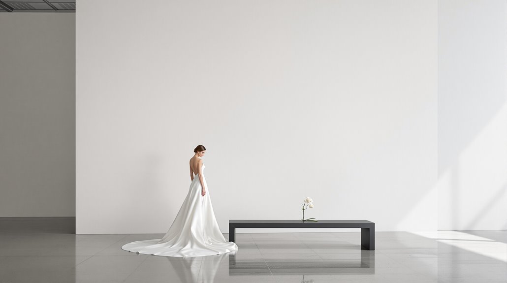
To design for museums without competing with art, embrace restraint as your guiding principle. Position elements using the 40-60% negative space rule, keep installations under 60 inches tall, and limit your palette to 2-3 complementary hues that echo exhibition tones. Avoid architectural showpieces—statement ceilings and grand staircases steal focus from artwork. Your role? Create invisible support systems that improve visitor experience without distraction. The most successful museum designs are those you barely notice, yet can’t imagine the space without.
The Competition Problem
While museums exist primarily to showcase art, the architectural and design elements within them often wage a silent war for visitors’ attention. You’ve seen it—the grandiose staircase that leaves Picassos forgotten, the dramatic lighting fixtures that outshine Renaissance masterpieces. This competition problem plagues even well-intentioned museum architecture, creating spaces where the container overwhelms the contained.
Gallery spatial planning requires ruthless prioritization, not ego. When architects design statement ceilings that draw eyes upward—away from the very paintings visitors came to see—they’ve fundamentally misunderstood their assignment. And yet, when display design recedes appropriately, it performs the magic trick of invisibility—supporting art without stealing its thunder. The Nelson-Atkins Museum expansion finalists all demonstrate a commitment to transparent, welcoming environments that serve the art rather than competing with it. This approach embodies quality over quantity principles, ensuring that every design choice enhances the visitor’s experience without detracting from the artwork.
The most successful museum spaces understand this essential truth: a gallery should be like an expert waiter—present when needed, invisible otherwise. You’re creating a stage for someone else’s performance, not starring in the show yourself.
Scale Appropriateness in Art Environments
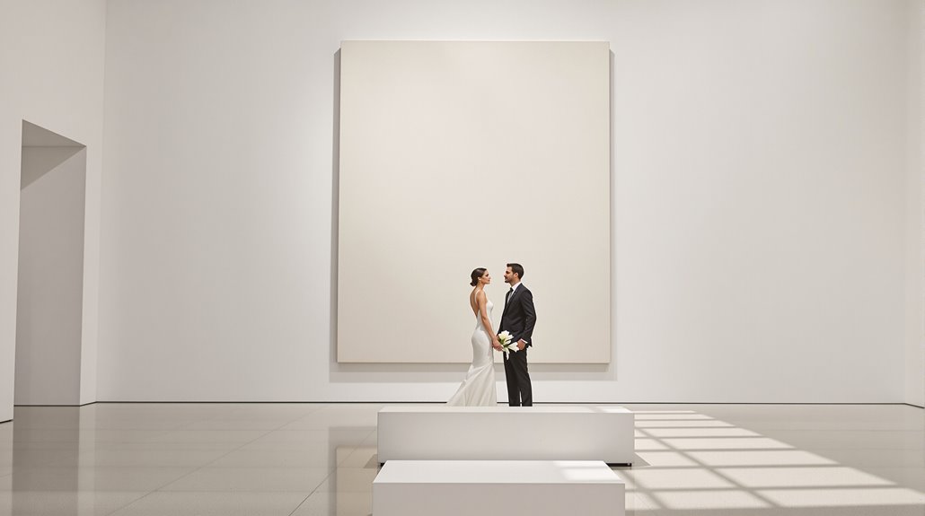
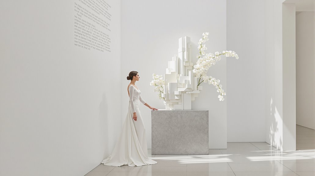
The battle for visual dominance extends beyond competing design elements—it’s fundamentally about scale. When planning museum wedding decor, you’re working within spaces carefully designed for art viewing distances and proportional relationships. That 8-foot floral installation might seem spectacular in your Pinterest board, but it’s competing with centuries of curatorial wisdom about spatial narrative. Understanding the psychology of luxury weddings for affluent couples can also inform your design choices, as these clients often value quality markers and decision-making in their event planning.
Art gallery wedding design requires acknowledging the existing visual hierarchy—you’re a temporary guest in a permanent collection’s home. The most successful styling for museum venues respects these proportional relationships through:
- Size-appropriate installations that complement rather than overwhelm artwork (think 36″ centerpieces, not 72″)
- Material consistency that creates visual continuity between your event elements and the gallery’s architecture
- Strategic placement that respects viewing distances and sight lines established by exhibit designers
Remember: restraint isn’t limitation—it’s meticulous recognition of the space’s primary purpose. Implementing movable walls and partitions can help create temporary event spaces that maintain the gallery’s integrity while accommodating your celebration needs without competing with the art.
Color Palettes That Complement vs Clash
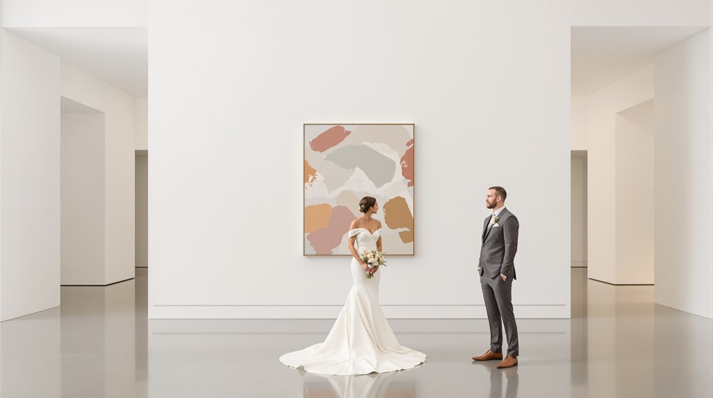
Choosing color palettes for museum event design requires steering a delicate balance between your wedding aesthetic and the existing artistic environment. Your museum wedding flowers should harmonize with—never compete against—the masterpieces surrounding them. Opt for two to three complementary hues rather than a rainbow explosion that overwhelms gallery spaces.
Museum floral design thrives when following the primary-supporting color hierarchy principle: select a dominant tone with subtle accents that echo (but don’t mimic) the exhibition’s palette. When planning museum wedding flowers, consider the emotional tone of your gallery—warm burgundies and deep teals create intimacy in cavernous spaces, while subdued greens and blues encourage contemplation alongside impressionist works. And yet, context matters profoundly; what works brilliantly in a contemporary white-cube gallery would feel jarringly modern in a Renaissance collection. Create visual rhythm through purposeful color pacing, allowing artistic focal points to breathe without competition from your design elements. Additionally, understanding old money aesthetic can inspire a sense of understated elegance in your color choices.
Installation Zones: Where Design Enhances
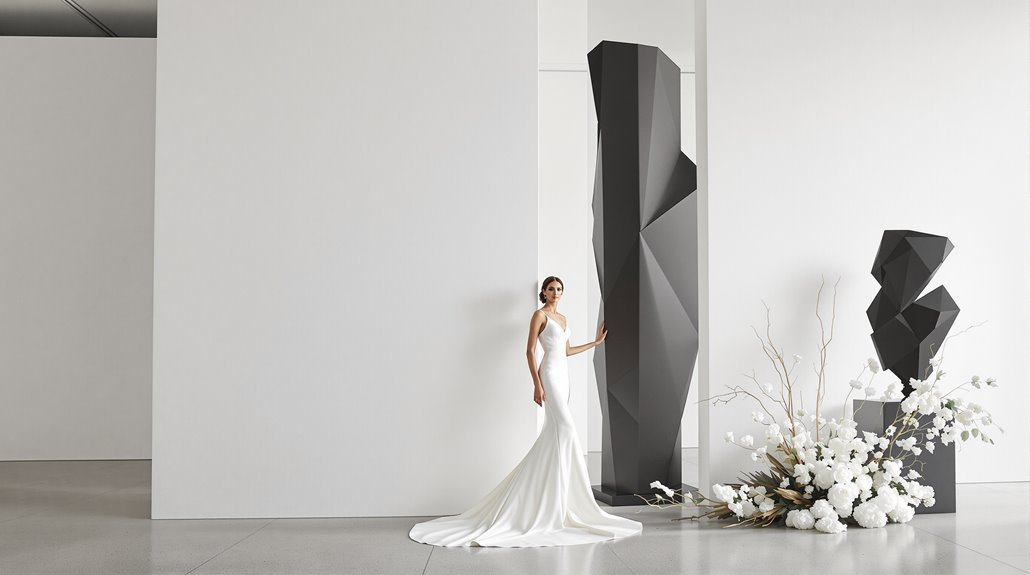
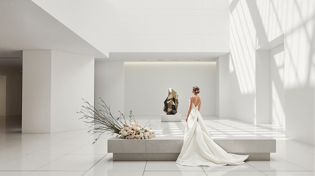
Tactical positioning of your design elements transforms museum spaces from potential battlegrounds into harmonious partnerships with the art. When planning museum wedding flowers, remember you’re working within a spatial composition that already has established focal points—the art itself. Your designs should occupy the 40-60% negative space intentionally left empty by curators, complementing rather than competing with priceless works.
Environmental control and lighting systems aren’t just technical requirements; they’re your design parameters. Work with, not against, the carefully calibrated conditions that protect art while making it visible.
- Position floral installations at intersections of the rule of thirds, never directly competing with major artworks
- Utilize staggered heights (below 60 inches) to maintain clear sightlines to wall-mounted pieces
- Incorporate sound-dampening materials in your design elements to preserve the acoustic integrity of galleries
The best museum designs acknowledge their secondary role—you’re creating beauty within beauty’s house, not staging a takeover.
Restraint as Design Philosophy
Restraint fundamentally honors the art itself—and this isn’t just polite deference, it’s design intelligence. When your museum architecture “all but disappears,” you’re making the profound choice to let Monet speak without your marble competing for attention. MOMA’s $425 million redesign exemplifies this—expanding from 7,900 to 11,600 square meters without architectural showboating.
You’ll find that architectural restraint demands deeper reflection than spectacle ever could. It’s about connecting visitors to art through clarity rather than distraction. And yet, this simplicity isn’t simple to achieve—it requires rigorous discipline and intention.
This approach aligns perfectly with sustainable design imperatives. Those extravagant glass atriums? Energy hogs. Those unnecessary flourishes? Material waste. When resources dwindle and budgets tighten, restraint becomes not just aesthetically refined but environmentally responsible. The most profound museum experiences happen when architecture knows exactly when to step back and let art take center stage.
Working with Museum Coordinators on Design
While grand artistic visions might captivate your imagination, successful museum design invariably hinges on your ability to forge meaningful partnerships with museum coordinators. When planning a museum wedding, remember you’re entering a sacred space of cultural significance—not merely an elegant backdrop for floral design museum enthusiasts to showcase their work. Establish a cooperative framework where both your design team and museum stakeholders share equal responsibility and voice in decisions.
Museum design success lies not in artistic grandeur but in meaningful partnerships with those who safeguard cultural spaces.
For effective collaboration with museum coordinators:
- Define clear roles upfront—designate who makes final calls on floral placement relative to exhibits
- Schedule regular prototype sessions—test museum wedding flowers with masking tape layouts before installation day
- Implement feedback loops—involve curators early to ensure 8-foot installations won’t compete with the Monet
You’ll need restraint, yes, but more critically, you’ll need systems for shared decision-making. The best museum designs emerge not from singular vision, but from respectful negotiation between artistic ambition and institutional integrity.
Examples: Museum Designs That Work
Successful museum designs reveal a paradox: the most influential designs often attract the least attention. Consider MONA’s minimalist gallery environments—dark, subterranean spaces where artwork dominates while traditional wall texts vanish completely. And yet, visitor involvement soars with their “O” device achieving a staggering 97% usage rate. You’re witnessing the perfect balance: clean architectural lines that defer to art while digital participation happens privately in visitors’ hands.
The Site Museum of Paracas Culture demonstrates how museum architecture can merge with scenery rather than compete for visual attention. Its material-focused approach prioritizes structure that complements rather than overwhelms the collection. Meanwhile, Cooper Hewitt’s digital tools deliver rich information without cluttering gallery walls with text.
The best designs recognize this truth: your role isn’t to upstage the art but to create conditions where visitors connect deeply with it—through elegant restraint and thoughtful integration.
When to Choose Different Venue Type
Choosing the right venue type depends fundamentally on understanding what your audience truly seeks—not what you think they should experience. The data speaks clearly: museums rank consistently lower for interactivity and social connection than alternative spaces. Your guests might secretly crave a more energetic environment, particularly if they’re younger or have children in tow.
Consider bypassing traditional museum architecture when:
- Your event demands high interactivity—science centers scored 42% higher on engagement metrics
- You’re targeting young adults without children—a demographic with pronounced museum visitation gaps
- Your design concept requires fewer behavioral restrictions for free exploration
Venue selection ultimately hinges on whether education or experience holds priority. Traditional museums excel as knowledge repositories, and yet they falter as social spaces. If your event concept leans heavily toward immersive, participatory moments rather than contemplative appreciation, perhaps that museum setting—however prestigious—deserves reconsideration.
Conclusion
Museum design walks a tightrope—honoring artistic masterpieces while crafting experiences that involve modern visitors. Your approach should recognize that you’re temporarily inhabiting hallowed space, not competing with permanent residents. The most successful museum installations demonstrate profound architectural harmony—acknowledging hierarchy rather than forcing interruption.
When planning your event, remember that restraint often communicates more sophistication than excess. An 8-foot floral installation beside a Monet creates visual chaos, but thoughtfully placed low arrangements guide attention rather than demand it. The museum’s inherent gravitas does the heavy lifting if you let it.
Exhibit engagement works best when it enhances rather than overwhelms. Your design choices telegraph values—respect for artistic context signals cultivation; competing with artwork suggests insecurity. Your guests will appreciate the breathing room to experience both your celebration and the cultural touchstones surrounding them—a balance that creates memorable, meaningful experiences without sacrificing aesthetic integrity.