Wedding colors aren’t mere decoration—they’re your personal manifesto. You’ll create deeper meaning by limiting yourself to 2-3 colors and exploring texture instead of endless hues. Consider how your palette affects emotions: reds energize receptions, blues calm ceremonies. Test colors in your venue’s lighting—existing architecture can double your budget if ignored. Cultural meanings matter too; what signals joy in one tradition might suggest mourning in another. Your photographer’s lens will finally translate these choices into lasting visual narratives.
Beyond Pinterest Palettes
While Pinterest might seduce you with its perfectly curated boards, real wedding color theory demands more than random scrolling until something “feels right.” Today’s couples are abandoning the safe harbors of blush and ivory for bold, declarative palettes that function as personal manifestos.
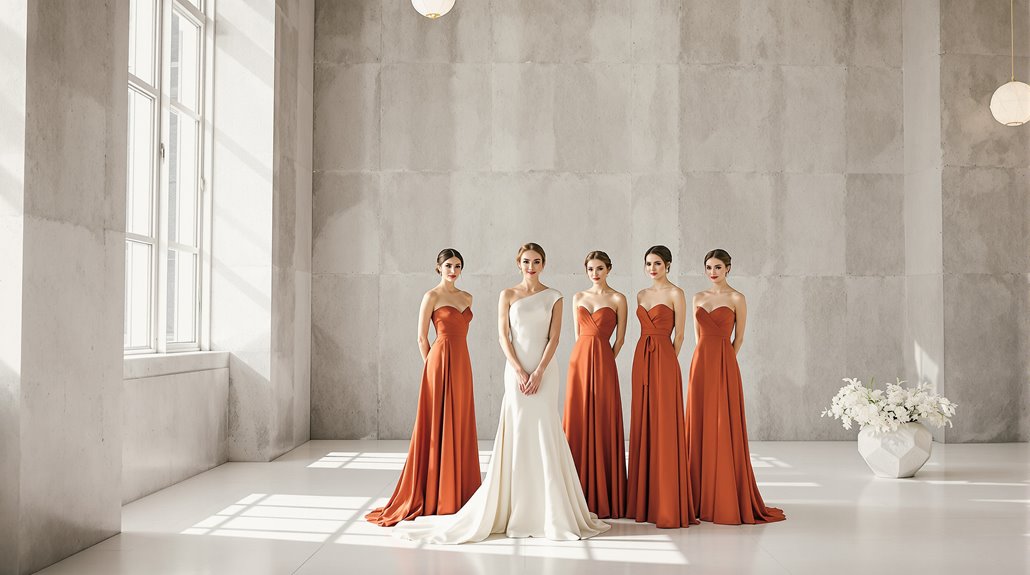
Your wedding color scheme isn’t merely decoration—it’s communication. The fuchsia-orange-light blue trio that catches your eye carries psychological weight, cultural resonance. Seasonal wedding colors matter too; that dark citron paired with orange reads differently in November than June. In 2026, we’re seeing a dramatic shift toward Hot Pink & Vibrant color schemes that infuse wedding decor with unmistakable joy and personality. This evolution reflects a broader trend where quality over quantity in design choices is celebrated.
Color combinations for weddings have evolved beyond the predictable five-to-seven hue spread. Modern celebrations embrace disciplined two-to-three color palettes, creating sophistication through restraint rather than variety. The result? A visual experience that feels curated, not collected.
And yet, within these concentrated palettes, complexity emerges through texture—luxe linens, velvet backdrops, satin finishes—proving that limitation breeds creativity when approached with intention.
Color Psychology in Wedding Contexts
Every time you glimpse a wedding color palette, your brain unconsciously participates in a complex emotional evaluation—registering joy, formality, intimacy, or nostalgia before you’ve even processed what you’re seeing. Choosing wedding colors isn’t merely aesthetic—it’s psychological architecture for your guests’ experience. When 68% of people associate red with love and 52% connect yellow with happiness, you’re tapping into primal, cross-cultural responses that transcend Pinterest trends.
- Warm colors (reds, oranges) intensify energy and sociability—perfect for receptions where you want dancing until dawn, as they align with the psychology of luxury weddings that affluent couples often consider.
- Cool tones (blues, greens) nurture contemplation and calmness—ideal for ceremonies emphasizing spiritual commitment.
- Seasonal alignment matters: autumn weddings demand warmth (burgundy, terracotta) while spring celebrations welcome softness.
- Your dominant/subordinate/accent color structure signals refined intentionality, not just “colors you like.”
The emotional impact of your palette extends beyond décor—it becomes the invisible soundtrack to your celebration. Colors like blue can invoke feelings of cleansing and cooling, making it an excellent choice for summer weddings where guests will appreciate the cooling qualities of your color scheme.
How Colors Photograph
Since your wedding photos will long outlast your centerpieces, understanding how colors actually translate through a camera lens becomes as essential as the palette itself. Your wedding color palette exists in a technical reality that Pinterest boards rarely acknowledge: light transforms everything.
Warm golden tones photograph with intimacy under sunset light but appear harsh in morning’s crisp cool qualities. Complementary colors—think coral bouquets against teal walls—create immediate visual hierarchy that cameras adore, while analogous combinations like soft pinks and peaches photograph with natural harmony. And yet, brightness and saturation impact emotional response more profoundly than the actual hues you’ve obsessed over.
Wedding color theory isn’t merely aesthetic—it’s technical. Your photographer battles white balance challenges as tungsten bulbs warm frames while LEDs cast green. Raw files help, but planning matters more. The wedding color psychology you’ve carefully selected might photograph entirely differently unless you’ve considered how environment, texture, and lighting interact with your chosen palette. Understanding effective tier allocation strategies can help inform your choices and ensure that your color selections not only look good in person but also translate beautifully in your photographs.
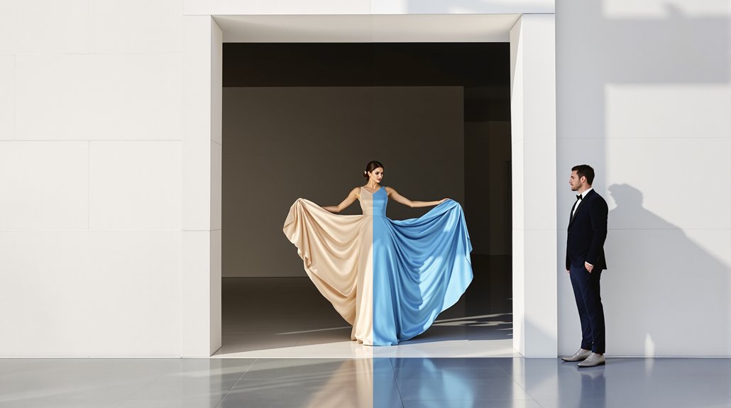
Seasonal Color Theory
The technical realities of wedding photography connect directly to another dimension of color selection—the seasons themselves. Your personal coloring—skin undertones, hair, and eyes—aligns with specific seasonal palettes that will naturally improve your appearance in photos. This isn’t superficial vanity; it’s practical application of color theory that dates back to the 1940s.
Choosing colors that align with your natural season isn’t vanity—it’s applying decades-old color science to ensure photographic brilliance.
- Spring types flourish in warm, clear palettes—peach, coral, and marigold that echo your golden undertones
- Summer individuals shine in soft, cool hues—sky blue, blush, and lilac that complement your naturally muted features
- Autumn coloring demands rich, earthy tones—caramel, forest green, and burnt orange reflecting your warm depth
- Winter types require saturated contrast—navy, burgundy, and ice pink that match your dramatic natural palette
You might instinctively gravitate toward colors that flatter you, and yet, understanding the technical structure behind this preference transforms intuition into intentional design that photographs brilliantly against your natural coloring.
Cultural Color Associations
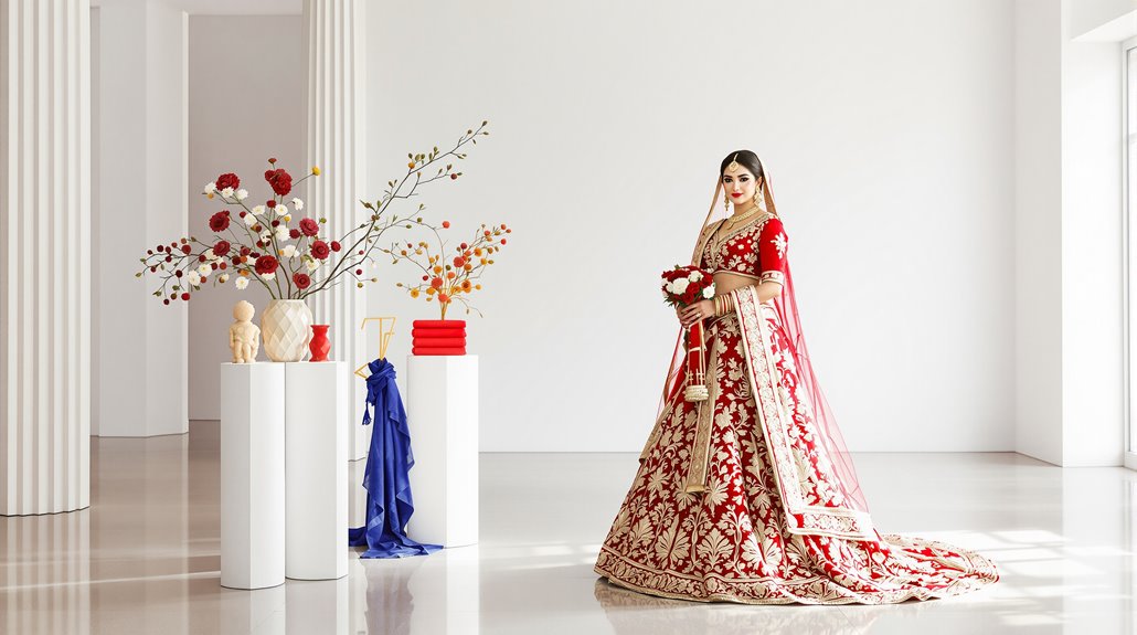
While your personal coloring guides technical selection, cultural heritage determines color meaning in ways you can’t afford to ignore. That pristine white gown—symbol of Western purity—would read as funeral attire across much of East Asia, where red dominates celebrations as the harbinger of prosperity and good fortune.
Cultural contexts rewrite the entire palette. South Asian weddings luxuriate in red and gold, honoring divine blessings and Goddess Lakshmi’s favor. Middle Eastern ceremonies incorporate protective green, representing paradise itself, while henna’s red-brown serves as spiritual armor against malevolent forces. Even blue—that supposedly “safe” choice—carries intense regional baggage: medieval Europe’s Marian devotion, Mediterranean evil-eye protection, Yoruba spiritual power signaling.
The colors you choose speak a language, whether you’re fluent in it or not. Your grandmother’s white dress represented something specific; your sister’s blush gown, something else entirely. Interrogate these meanings before committing to your palette.
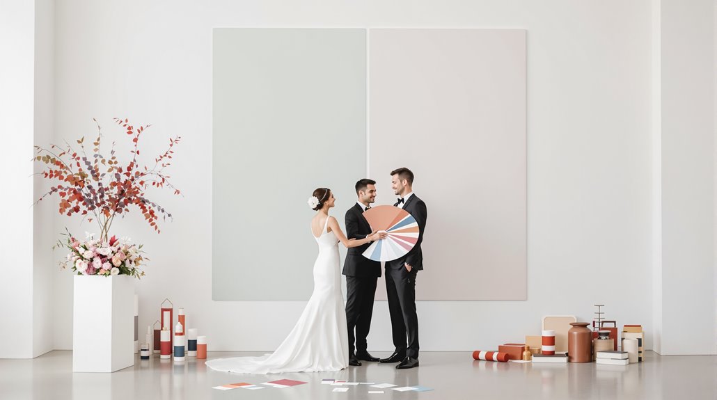
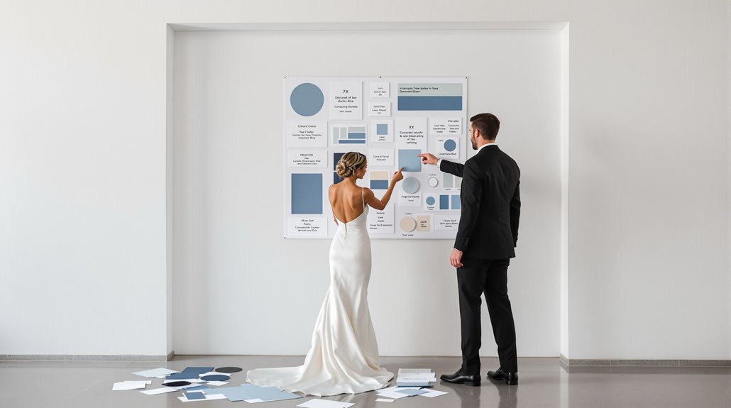
Building Cohesive Palettes – System approach
Understanding cultural color contexts sets the stage for your next critical decision: building a cohesive wedding palette. Most couples select hues based on gut feeling—and yet, color harmony follows predictable mathematical and psychological principles that, when applied deliberately, raise your aesthetic from pretty to profound.
Your palette structure should follow the 60-30-10 distribution system—dominant color anchoring your space, secondary color providing depth, and accent color delivering polish. This isn’t arbitrary; it’s visual science.
- Start with relationship structures: monochromatic for elegance, analogous for cohesion, complementary for drama
- Limit yourself to 3-5 total colors, including at least one neutral
- Consider the venue’s existing palette—fighting it requires twice the budget
- Test colors in varying lighting conditions—daylight reveals undertones hidden by venue lighting
Remember: your palette isn’t just decoration—it’s the silent structure of emotional experience throughout your celebration.
Color and Venue Interaction
Every venue tells a color story, whether you acknowledge it or not. That industrial warehouse with exposed brick isn’t neutral—it’s commanding rust reds, weathered browns, and metallic grays that will fight your pastel pink dreams. And yet, understanding this tension creates opportunity: contrast can be more memorable than harmony.
Your venue’s lighting transforms everything. Natural daylight reveals true colors; evening reception lighting can render your carefully selected mauve into muddy brown.
| Venue Type | Optimal Color Approach | Color Pitfalls |
|---|---|---|
| Beach | Blues, neutrals, whites | Pastels fade in harsh sun |
| Ballroom | Metallics, jewel tones | Dark colors absorb light |
| Garden | Soft greens, blush, ivory | Competing with nature’s palette |
| Barn | Burgundy, orange, yellow | Too-bright colors look artificial |
| Industrial | Navy, emerald, gold | White appears dingy |
Don’t force beachy aquas into a winter ballroom—it’s dissonant, jarring. Instead, let your venue guide you toward colors that feel inevitable rather than imposed.
Technical Considerations
Beyond aesthetics and symbolism, the technical reality of wedding colors demands careful attention from couples who might alternatively focus solely on what looks pretty. Your chosen palette will shift dramatically under venue lighting—that romantic burgundy you loved in the store might read as muddy brown in sunset photos. You’ll need to test swatches under identical lighting conditions at the same time of day as your ceremony.
- Test colors using phone photography to capture actual rendering—screens don’t lie about how colors translate
- Reduce saturation tactically to transform harsh purple into dreamy lavender without losing your core palette
- Remember RGB color model governs all photography, not the RYB system you learned in elementary school
- Understand tints (color+white) versus shades (color+black) to communicate precisely with vendors
Post-processing ultimately determines your wedding’s visual signature, transforming technical color choices into emotional storytelling. The right adjustments uplift ordinary photos into cohesive galleries that feel intentional rather than accidental.
Conclusion
The technical mastery of color represents just one facet of a wedding’s chromatic story—your personal color narrative awaits its conclusion. As 2026 approaches, the industry’s trajectory is unmistakable: couples are abandoning rigid color formulas for personalized expression that privileges aesthetic over convention. Your palette might feature bold jewel tones that would’ve been unthinkable five years ago, or perhaps a monochromatic scheme with texture providing the visual interest.
The most successful weddings of tomorrow will limit themselves to 2-3 colors rather than the overwhelming 5-7 palette combinations of yesteryear. And yet, this constraint paradoxically creates greater freedom—a focused canvas upon which your unique love story unfolds. Whether you embrace vibrant reds and fuchsias or opt for tactical color blocking with neutral backgrounds, remember that your wedding’s hues should reflect your relationship’s authentic vibrance, not a Pinterest board’s algorithmic suggestions. Color is psychology made visible—choose accordingly.