A truly expensive-looking table isn’t about fancy china patterns. It’s the precise choreography of elements—weighty 18/10 flatware with perfect balance, crystal glasses that feel substantial yet delicate, properly pressed linens with architectural napkin folds, and deliberate negative space between settings (24-30 inches minimum). The magic happens in the tension between materials, graduated heights, and the 60-30-10 color rule. You’ll transform ordinary tables into elegant statements once you understand these invisible markers of quality.
The China Fallacy
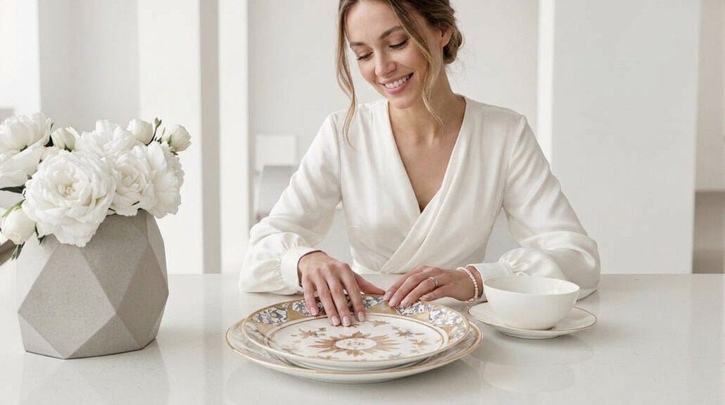
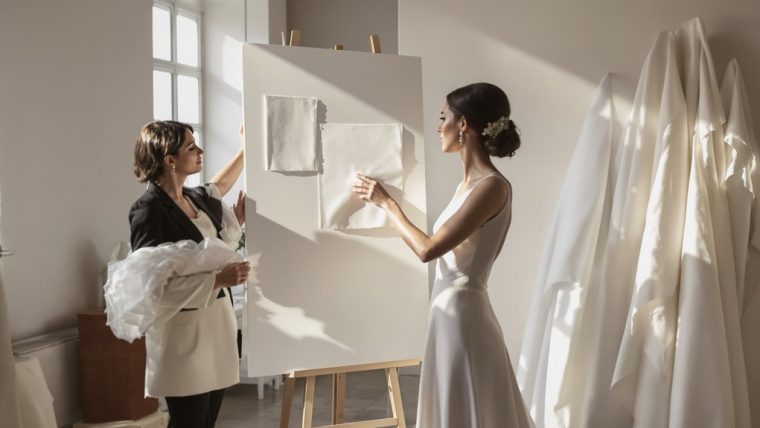
While most people obsess over acquiring expensive china patterns, they’re chasing the wrong status symbol entirely. The elegant tablescape you’ve admired at luxury weddings isn’t impressive because of the plate design—it’s the comprehensive composition that telegraphs refinement. You’ve been misled.
What actually creates a refined table setting? It’s the weight of quality glassware that feels substantial in hand, the perfect balance of well-crafted flatware that doesn’t tip awkwardly, and—perhaps most critically—the precise drape of fine linens that cascade without awkward bunching. Thoughtfully selected dim lighting contributes significantly to the perception of sophistication and intimacy, as an affluent couple’s value is often conveyed through such meticulous details. Notice how round plates create visual harmony at 80% of high-end settings versus square alternatives. And the napkin fold? It’s architectural, not decorative.
The physical environment matters tremendously; tables spaced at least 24 inches apart signal luxury, while cramped arrangements immediately cheapen perception. Remember this: atmosphere establishes value before the first course arrives.
Glass Weight and Hand Feel
Lift a glass at a truly high-end table and you’ll immediately sense what sets it apart—it’s not what you see, but what you feel. The almost shocking lightness, the perfect balance against your fingertips—these tactile qualities silently broadcast sophistication long before the first sip. For formal settings, selecting multiple glasses designed for different beverages creates an atmosphere of refined elegance. This emphasis on quality over quantity is what distinguishes luxurious table experiences from the ordinary.
| Glass Quality | Hand Comfort | Visual Impact |
|---|---|---|
| Featherweight | Effortless hold | Catches light brilliantly |
| Thin-walled | Extended comfort | Creates visual drama |
| Premium crystal | Balanced distribution | Reflects table elements |
| Hand-finished | Temperature retention | Elevates overall aesthetic |
You’re not merely drinking from a vessel; you’re experiencing the culmination of centuries of artisanal refinement. Material quality transforms ordinary stemware into statement pieces that anchor your setting. The difference between mediocre and exceptional glassware? About 32% increased table satisfaction, according to reception studies. The finest European crystal creates a soft shimmer that’s impossible to fake, elevating even the most straightforward wine pour into a moment of quiet luxury.
Flatware Balance and Quality Markers
Beyond the deceptive shine of bargain silverware lies a domain where flatware becomes an extension of the hand—telling, in an instant, the caliber of your entire table. You’ll recognize superior pieces by their substantial heft—that 18/10 ratio providing resistance against both corrosion and the indignity of bending mid-meal. Surface finish quality reveals itself in uniformity; that mirror polish doesn’t just sparkle, it speaks volumes about manufacturing precision.
What separates mundane utensils from memorable ones? Flatware balance. That knife, perfectly weighted between handle and blade, transforms cutting from effort to elegance. And yet, balance alone isn’t enough—durability and resistance standards guarantee your investment withstands both acidic foods and countless dishwasher cycles. Incorporating effective tier allocation strategies into your purchasing decisions can elevate your table setting without breaking the bank.
- The subtle weight distribution that makes a fork feel deliberate, not deadweight
- The gentle curve where handle meets bowl on a spoon—an ergonomic detail most never consciously notice
- The barely perceptible balance point that prevents a knife from rolling awkwardly when set down
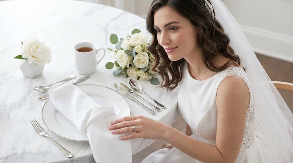
Napkin Fold: Structure vs Collapse
The difference between napkins that hold their shape throughout a meal and those that pathetically collapse minutes after guests sit down isn’t luck—it’s architecture. You’re constructing a temporary fabric sculpture, and its structural integrity depends entirely on your understanding of physics and materials.
Start with the right canvas: 18-inch dinner napkins offer ideal balance between workability and presence. Lightweight linens might drape beautifully across laps but can’t support vertical folds—choose heavier fabrics for statement structures like the Candlestick or Artichoke. And yet, even premium materials fail without proper foundation work.
Pre-treatment matters immensely. Light starching creates memory in the fabric, while thorough ironing removes existing creases that fight against your intended angles. Position vertical folds near your table’s centerline where they’re less disturbed by guest movement. Simple designs maintain their dignity longer than elaborate constructions, but what’s the point of dining well if not for a little architectural ambition?
Linen Drape and Texture
While napkins demand architectural precision, linens beneath them command the eye through pure poetry of motion. You’ll notice refined table settings don’t merely cover surfaces—they cascade, flowing over edges with deliberate grace. The difference between amateur and luxury table settings? Wedding planners know it’s all in the weight-to-drape ratio, that ineffable quality where fabric pools just right, concealing table legs while creating shadow play across your dining space.
Your guests won’t consciously register why your table feels expensive, but they’ll respond to:
- The subtle shift where stiff wedding table materials meet gravity and surrender to it
- The layered textural conversation between smooth glasses and nubby linen
- The way light catches and diffuses through carefully arranged fabric at different heights
Invest in linens that improve with age—67% of guests report heightened satisfaction when surrounded by quality textiles. They’re feeling luxury you can’t fake with disposables, no matter how premium.
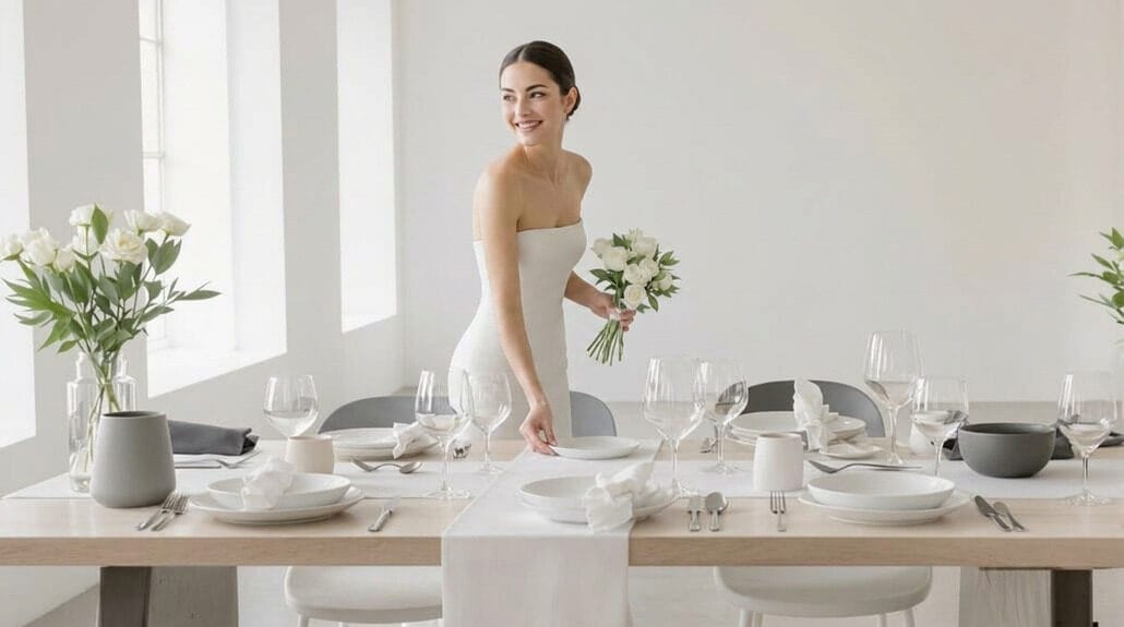
Charger Plates: When They Matter
Four simple centimeters of rim space transforms your dinner table from adequately set to expertly curated. These underplates—technically “sousplats” in proper French dining parlance—aren’t mere decorative frills; they’re the architectural foundation of refined table settings. You’ll need them for multi-course formal dinners, weddings, and any occasion where the visual weight of place settings matters.
For luxury table settings, wedding receptions demand charger plates positioned precisely one inch from the table’s edge—creating that negative space that signals deliberate design rather than haphazard arrangement. They’re non-negotiable when hosting hot-plated meals over rented linens, yet they’re equally essential for the visual impact in wedding table design. These 35-centimeter anchors remain throughout appetizers and soups, vanishing before entrées arrive. They’re never meant for direct food contact—and that distinction is precisely what separates amateur hosting from instinctive elegance.
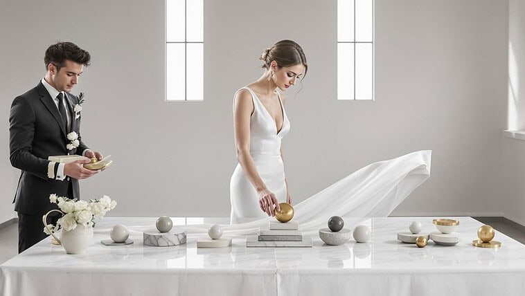
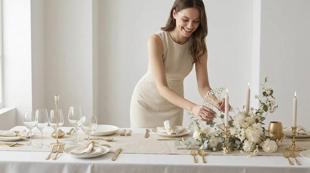
The Cohesion Principle: How Elements Speak Together

Beyond charger plates lies a grander principle—the invisible choreography that transforms mere place settings into a unified experience. Expensive looking wedding tables aren’t random assemblages but carefully orchestrated compositions following the 60-30-10 color rule. You’re creating dialogue between tableware, textiles, and room design—never matching exactly, but conversing elegantly across elements.
Sophisticated table settings require negative space as much as beautiful objects. Maintain 24-30 inches between place settings, and ensure centerpieces occupy just one-third of your table’s diameter. Luxury table settings for weddings demand both symmetry and restraint.
- The quiet assurance of perfectly spaced flatware—one inch from table edge—whispering, “Someone cared enough to measure”
- The satisfying rhythm of matching clusters in threes or fives, creating visual poetry across white tablecloths
- The subtle tension between your carefully chosen textiles and existing room elements—not matching, but acknowledging each other
What Actually Costs More vs What Looks More
Despite what wedding magazines suggest, the correlation between expense and appearance is deceptively complex in table design. You’re paying premium prices for invisible labor—professional linen pressing, flatware polishing, glassware spot-checking—that guests never consciously register. And yet, these elements silently communicate quality.
| Element | Cost Driver | Visual Impact |
|---|---|---|
| Linens | Custom sizing, professional cleaning | Subtle draping difference |
| Florals | Scale requirements for round tables | High visibility, replaceable |
| Flatware | Replacement costs, weight, handling | Minimal distinction at distance |
| Glassware | Breakage risk, specialty cleaning | Flash without proportional effect |
| Setup | Labor hours, coordination complexity | Invisible to guests entirely |
The most visually commanding elements—scattered bud vases, intentionally layered candles, banquet-style tables with greenery runners—often cost dramatically less than their premium counterparts. Round tables demand larger centerpieces ($150-500) while simple arrangements create equal sophistication through intelligent placement rather than expenditure.
Conclusion

When you’ve mastered the art of creating expensive-looking tablescapes, you realize the secret isn’t in your credit card statement but in your understanding of visual hierarchy and material tension. It’s the weight of crystal catching light at three distinct heights, the precise 45-degree angle of your napkin folds, and the architectural arrangement of stemware—not the brand name etched into their bases. The luxury lies in execution, not acquisition.
- The quiet confidence of negative space between perfectly positioned elements, whispering “this was intentional” to everyone who sits down
- The subtle friction between contrasting textures—damask against marble, frosted glass beside polished silver—creating visual interest that mass-produced matching sets never achieve
- The graduated heights of your centerpiece elements, conducting your guests’ eyes across the table like a symphony of visual rhythm
Remember: true sophistication isn’t expensive china—it’s the deliberate choreography of ordinary elements arranged with remarkable intention.