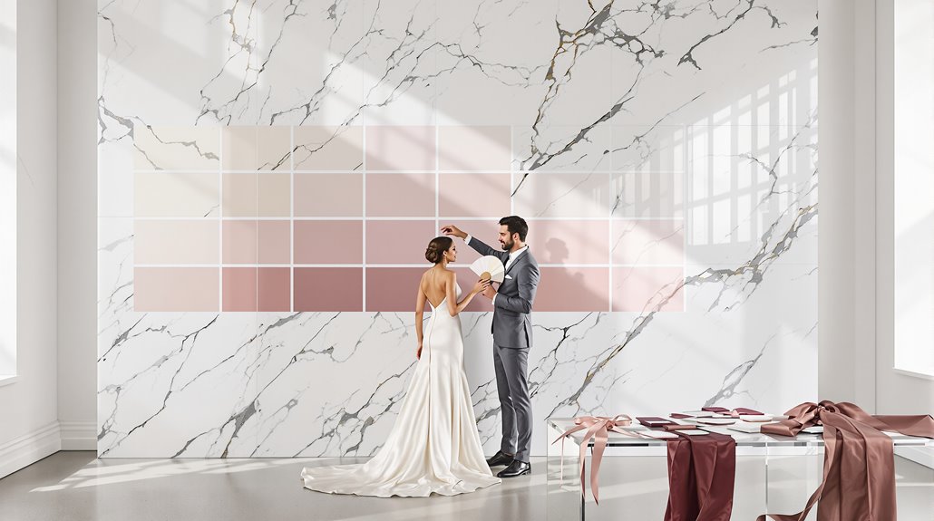
For timeless wedding photos, choose neutral tones (ivory, gray) or muted hues that flatter your skin undertone—cool skin works with navy and whites; warm skin glows with earthy tones. Test your palette in diverse lighting conditions, especially during golden hour (60 minutes before sunset), when colors appear most flattering. Avoid saturated oranges, muddy purples, and neons which photograph poorly. Your photographer’s early input can prevent palette disasters that no filter will fix later.
Why This Matters: Photography Permanence
While your wedding day lasts just 24 hours, your color choices will live in photographs for decades—perhaps even generations. That rustic barn reception might last until midnight, but those berry-toned bridesmaid dresses? They’ll populate your albums, frames, and digital archives for the next fifty years. Photography permanence demands intentionality.
Your wedding palette photography requires foresight beyond what’s trending. Some trendy colors become visual time stamps—immediately dating your images to 2025. And yet, warm neutrals and rich, complex tones maintain their relevance beautifully in 2027, 2030, and beyond. Photographers understand that these color selections influence the emotional journey viewers experience when revisiting your wedding memories. Embracing quiet luxury allows for a timeless aesthetic that can elevate your color choices.
Colors that are camera friendly—putty tones, aged plaster finishes, deep burgundies—photograph consistently across lighting conditions, preventing technical nightmares. That neon coral you’re considering? Gorgeous in person, but potentially catastrophic on camera, blowing out completely or shifting dramatically between indoor and outdoor settings. These aren’t just aesthetic choices; they’re visual legacies.
Film vs Digital Color Rendering
Because your photographer’s medium directly determines how your wedding colors translate to permanent images, understanding the fundamental differences between film and digital rendering becomes essential. Film color rendering creates a watercolor-like effect—colors melt together with dimensional blending, while skin tones appear creamy and warm. It’s not just nostalgic; it’s physically superior in tonal range, holding those tricky highlights where digital introduces gray or pixelation. Film creates a dreamy, artistic effect that closely resembles pictorial art, elevating your wedding colors beyond mere documentation. Additionally, many affluent couples seek quality markers in their wedding photography, making the choice between film and digital even more significant.
Digital color rendering, nonetheless, delivers crisp, controlled precision. You’ll get consistent results, vivid clarity, and infinite post-processing potential. And yet, digital struggles to achieve film’s organic warmth without extensive editing.
Your choice matters tremendously. Film maintains color accuracy across viewing platforms without filter dependency—what you see truly is what you get. That purple you’ve selected might photograph muddy on digital but render beautifully on film, or vice versa. The medium itself becomes part of your palette’s permanent story.
Colors That Photograph Beautifully
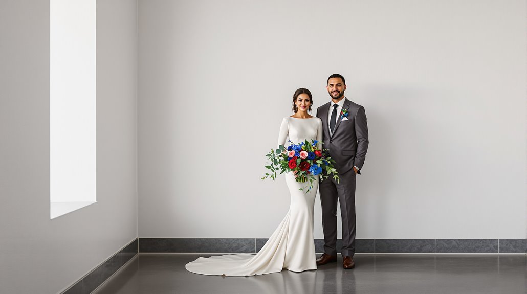
Now that you understand how your chosen medium affects color translation, let’s examine which specific hues actually photograph well. Neutrals—gray, beige, ivory—create a timeless foundation that won’t distract from your subjects. They’re workhorses, really. Muted tones consistently outperform their vibrant counterparts: lavender over bright purple, blush instead of magenta.
Blue-based palettes remain the quintessential photogenic wedding colors, particularly when paired with greenery or open skies. They simply work. Pastels reflect natural light beautifully, producing that coveted ethereal quality in portraits—think soft peach with baby’s breath.
And yet, deeper colors can photograph brilliantly when balanced properly. Burgundy creates stunning detail shots when offset by creams. Forest green pops against light backgrounds. The photogenic wedding colors spectrum isn’t limited; it’s deliberate. Your palette will tell your story for decades—choose colors that photograph like they’re remembering the best day of your life, not fighting against it. Additionally, the current luxury trends in wedding design emphasize the importance of color harmony to enhance visual storytelling.
Colors That Create Problems
Despite your best intentions, certain color choices will actively sabotage your wedding photos, leaving you with images that fail to capture the day’s true beauty. That lively orange bridesmaid dress? It’ll likely blow out in camera, while those deep purples might render as muddy disappointments rather than royal elegance.
The most problematic culprits include:
- Highly saturated oranges that transform skin tones into Oompa Loompa territory
- Purple shades (especially in florals) that lose dimension and appear flat
- Neon greens that create over-saturation nightmares and attract unwanted attention
- Mixed lighting venues where tungsten bulbs and LEDs battle for color temperature dominance
- High-contrast combinations that force photographers into impossible exposure compromises
Inconsistent color grading becomes nearly inevitable when battling these problematic hues. Your best defense? Choose softer, more neutral versions of bold colors—still lively, but with enough restraint to photograph beautifully under various lighting conditions.
Lighting Interaction With Color
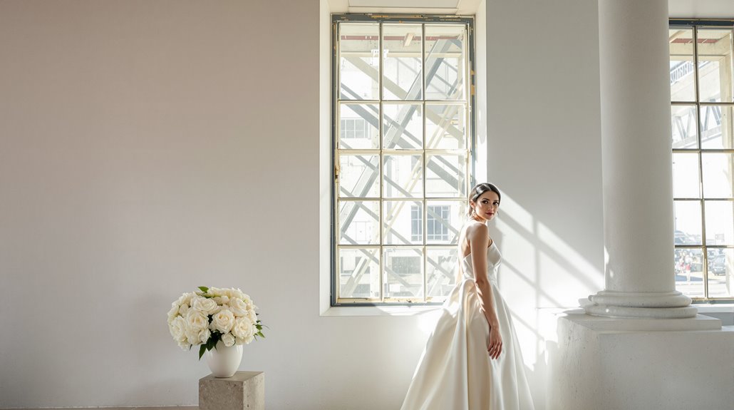
The interaction between lighting conditions and your chosen color palette might be the most underappreciated factor in wedding photography success. Those camera friendly colors you’ve carefully selected? They’ll transform—drastically—under different lighting conditions, sometimes for better, often for worse.
Golden hour lighting creates the most forgiving environment for your wedding color photography, bathing everything in warm, flattering tones that improve reds and oranges while softening potentially problematic purples. But timing matters. Plan key photo moments for approximately 60 minutes before sunset to capitalize on this magical light that photographers worship, not just praise.
Conversely, harsh midday sun will bleach out your carefully chosen palette, creating shadows that distort color perception entirely. And blue hour? It’s ideal for cool-toned schemes but can turn warm palettes muddy. Your burgundy bridesmaids’ dresses might photograph beautifully at sunset yet appear almost brown in midday shadows—a reality worth considering during planning.
Skin Tone Considerations
Your skin tone isn’t just a beauty consideration—it’s a photographic variable that fundamentally shapes how colors translate in wedding imagery. Understanding your undertone—warm, cool, or neutral—provides the foundation for selecting wedding colors that photograph well. Your veins tell the truth: green suggests warmth, blue indicates coolness, blue-green points to neutrality.
Camera friendly colors align with your natural undertone, preventing that dreaded orange blowout or purple muddiness. The difference is stark—like night and day in the final album.
- Cool undertones shine with jewel tones, navy blues, and crisp whites
- Warm undertones glow alongside earthy tones, creams, and rosy reds
- Neutral undertones enjoy extraordinary flexibility across the spectrum
- Mixed-undertone wedding parties require tactical color bridging
- Seasonal palettes should still respect undertone fundamentals
Your photographer will thank you for this attention to skin undertones—and yet, the most important thing remains how confident you feel in your chosen palette.
Testing Your Palette
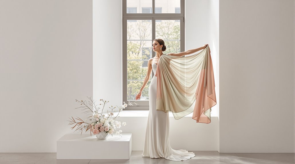
Because colors transform dramatically under different conditions, testing your palette before finalizing wedding decisions separates the amateurs from the truly prepared couples. You’ll need to evaluate your colors in multiple environments—near windows, outdoors during golden hour, and under venue lighting that might be tungsten (3200K) or fluorescent.
Start with white balance calibration. A simple gray card placed in your venue lets photographers establish true color accuracy, preventing that gorgeous blush from morphing into sickly peach. Take sample swatches to your venue at the exact time of day you’ll be celebrating, and photograph them using your phone’s pro mode.
Environmental testing reveals brutal truths: those rich purples might photograph muddy, while certain oranges blow out completely. And yet, this isn’t about abandoning your vision—it’s refining it. Adjusting saturation levels by just 10-15% can transform a problematic palette into photographic perfection that’ll live beautifully in your albums forever.
Photographer Input Value
Why do professional photographers cringe when couples announce their “perfect” burgundy and purple palette? They know what you don’t—certain color combinations turn into muddy disasters on camera. Your photographer brings invaluable expertise about camera friendly colors that can save your wedding gallery from technical limitations no Instagram filter can fix.
Seeking your photographer’s input early delivers five vital benefits:
- They’ll identify wedding colors that photograph well in your specific venue’s lighting conditions
- They can suggest tweaks to problematic hues (like toning down certain oranges that tend to blow out)
- Their experience reveals which colors improve rather than compete with natural backgrounds
- They understand how your palette will translate across different times of day
- Their technical knowledge of HSL adjustments helps predict how colors will appear in final edits
Trust their advice—they’ve seen hundreds of palettes succeed and fail. The best wedding colors photos come from collaborations where photographers’ technical wisdom meets your aesthetic vision.
Conclusion
Creating the perfect wedding color palette isn’t just art—it’s science with emotional stakes. Your choices determine how your memories translate through a camera’s lens, with photogenic wedding colors making all the difference between timeless elegance and dated disappointment. Remember that certain colors simply perform better on camera, creating a harmony that raise every frame.
| Palette Type | Camera Performance | Emotional Impact |
|---|---|---|
| Pastels & Neutrals | High clarity, minimal blowout | Timeless, refined |
| Bold Primaries | Can oversaturate, requires skill | Energetic, statement-making |
| Earth Tones | Excellent in natural light | Warm, intimate connection |
Trust your photographer’s guidance on camera-friendly colors. They’ve witnessed firsthand how certain purples muddy while specific oranges blow out under flash. And yet, your palette should still feel authentic to your vision. Balance technical considerations with personal meaning, and you’ll create wedding colors that photograph well while still telling your unique story.

