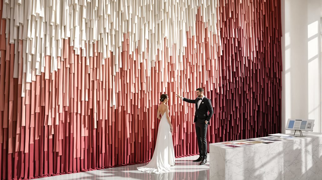
Your wedding palette speaks volumes before your guests hear a single vow. Those blush pinks and sage greens? They’re broadcasting your reverence for tradition and nature’s harmony. Bold jewel tones announce confidence; monochromatic schemes whisper sophistication. Colors carry different signals across generations and cultures—what reads as “timeless” to Boomers might scream “basic” to Gen Z. The difference between an intentional color story and a Pinterest-trendy default determines whether your palette remains meaningful decades later or merely timestamps your celebration.
Colors as Semiotics – Essay opening
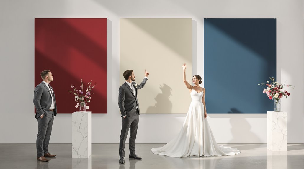
When we discuss wedding palettes, we’re actually examining a polished visual language that communicates before a single word is exchanged. Your chosen colors aren’t merely decorative—they’re semiotic declarations, broadcasting precise messages about your personality, values, and relationship dynamics to everyone who receives that save-the-date. Wedding color psychology functions through layered significance: immediate neurological response (red accelerates heartbeats), cultural coding (white means purity in Western contexts, mourning in Eastern ones), and status signification (jewel tones suggest wealth; pastels convey whimsy).
In the context of quiet luxury, the elegance of your color choices can further enhance the sophistication of your wedding’s overall aesthetic. The burgundy-and-gold palette you’ve been eyeing? It’s telling guests you value tradition, luxury, and dramatic romance—your wedding color symbolism reveals more than you think. But wedding palette meaning shifts with context: those same rich tones at a winter ceremony read differently than at a garden celebration in June. Your selections create an emotional blueprint for the experience you’re designing, communicating your intentions before guests ever arrive. This is especially evident with purple shades, where darker tones communicate luxury and nobility, drawing upon centuries of royal associations.
Blush Pink & Sage Green: What It Signals
Despite its current ubiquity at millennial weddings, the blush-pink-and-sage-green palette reveals far more about you than simply “I spend time on Pinterest.” This soft, ethereal combination—simultaneously timeless and painfully 2016-2022—broadcasts specific personality markers to your guests before they’ve even tasted your signature cocktail. Sage green in wedding attire symbolizes renewal and growth, perfectly complementing the transitional nature of marriage ceremonies. Additionally, this palette reflects a psychology of luxury weddings that emphasizes the importance of decision-making rooted in personal values.
| Color Choice Meaning | What Your Wedding Colors Say |
|---|---|
| Blush Pink | Femininity, vulnerability, softness |
| Sage Green | Nature-connection, tranquility, healing |
| Together | Romantic, enchanting, fairytale aesthetic |
| Emotional Tone | Serene, dreamy, nostalgic |
| About You | Values harmony, tradition with subtle twist |
You’ve selected a palette that whispers rather than shouts—prioritizing atmosphere over statement. The pairing communicates your desire for a celebration grounded in nature’s gentlest tones. And yet, this seemingly safe choice contains multitudes: historically, pink belonged to boys, suggesting your wedding color meaning challenges modern assumptions through its very traditionalism.
Monochromatic Palettes: Sophistication Reading
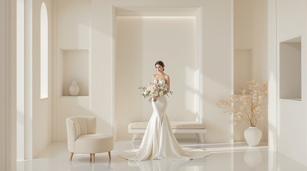
Monochromatic palettes speak volumes about your aesthetic priorities before your guests ever step foot in your venue. You’re signaling restraint, confidence, intentionality—a mind that edits rather than accumulates. This color psychology approach creates immediate cohesion, transforming even budget-conscious celebrations into studies of refinement through their singular focus.
Your choice within the monochromatic spectrum reveals even more. Navy communicates trustworthiness and tradition; purple declares creative independence; white and ivory whisper understated luxury. The monochromatic design strategy isn’t about simplicity, but depth—creating visual richness through texture, material, and subtle variation rather than color contrast.
It’s the design equivalent of a capsule wardrobe: elevated, effortless, enviable. And yet, the approach demands discipline. Without carefully calibrated tonal shifts—at least three variations within your chosen hue—the effect flattens from refined to stark. Your guests read this palette as evidence of your discerning eye, your commitment to elegance over spectacle. Additionally, effective tier allocation strategies can further enhance your overall wedding budget management, ensuring that your chosen palette shines even brighter.
Bold Colors: Confidence or Trend-Chasing
Unlike soft neutrals that whisper, bold colors shout your intentions from across the reception hall. When you select lively reds, fiery burgundies, or hot pinks, you’re making a physiological impact—literally increasing your guests’ heart rates and energy levels. You’re not playing it safe; you’re showcasing confidence in your aesthetic judgment.
Bold colors represent more than a momentary trend-chasing impulse. They’re declarations of personality, statements of individuality that transcend seasonal fads. Consider the psychological power: saturated hues transform ordinary venues into remarkable experiences, commanding attention through their visual impact rather than their Instagram prevalence.
And yet, there’s nuance here. The specific bold palette matters—red conveys timeless passion across cultures; yellow-green-blue combinations signal creative adventurousness; hot pinks demonstrate playful sophistication. Your selection isn’t merely about attention-grabbing; it’s about authentic expression through color psychology, transforming your celebration into a true artistic statement.
Generational Color Readings
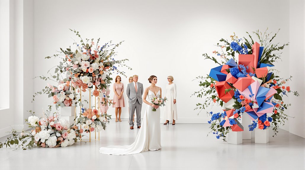
As wedding colors shift from mere aesthetics to generational markers, today’s palette choices reflect profound demographic shifts occurring in real-time. Your color choice meaning extends beyond personal taste—it’s now a demographic timestamp.
When you select sage green (embraced by 38% of Gen Z versus 33% nationally), you’re signaling your generational identity. The wedding color meaning has evolved dramatically as Gen Z overtakes Millennials, commanding 51% of the market with their nature-rooted aesthetics and romantic sensibilities.
What wedding colors say about you varies by audience age. Boomers might read your white-and-green palette as timeless, but fellow Gen Z guests recognize the intentionality behind it—part of the 84% who carefully select colors with meaning. Your oxblood and ivory whispers restraint; your blush and sage screams “Pinterest 2018.”
The earth tones dominating 2026 weddings aren’t just pretty—they’re philosophical statements rejecting maximalism for romanticism, tradition reimagined rather than abandoned.
Cultural Context Matters
When you select wedding colors without cultural context, you’re speaking a dialect your guests might not understand. That white gown you’ve dreamed of? In China, it screams funeral, not fairytale. Your wedding color meaning shifts dramatically across cultural borders—red signals passion in Western traditions but represents essential life force and protection throughout Asia.
What wedding colors say depends entirely on who’s looking. The oxblood and gold palette that reads as refined restraint to your American friends might signal religious devotion to Middle Eastern guests. And yet, cultural color associations run deeper than mere aesthetic preference; they’re psychological anchors built through centuries of ritual practice.
Your color choice meaning reflects whether you prioritize fashion (like Victoria’s white-lace revolution of 1840) or tradition (like China’s red wedding customs persisting for millennia). Before finalizing that Pinterest-perfect palette, consider: whose color language are you speaking?
How Guests Read Your Choices
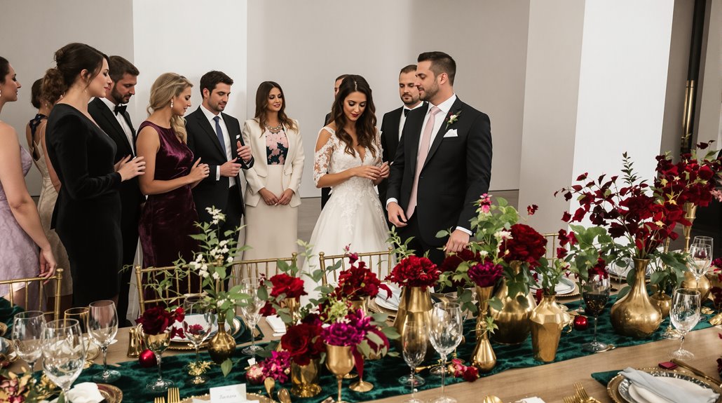
Your palette speaks volumes before your first guest arrives. The wedding color meaning extends beyond décor—it’s a psychological primer, setting emotional expectations while telegraphing your values with startling accuracy. Guests subconsciously interpret your choices, forming impressions about your personality, taste level, and even relationship vibrancy.
| Color Choice | What Guests Read | Cultural Significance |
|---|---|---|
| Bold Reds/Burgundies | Confident, passionate | Traditional prosperity in Eastern cultures |
| White/Ivory | Traditional, restrained | Western purity, Eastern mourning |
| Blush/Pastels | Romantic, sentimental | Youth and innocence across traditions |
| Jewel Tones | Refined, dramatic | Royalty and wealth signaling |
| Monochromatic | Design-savvy, intentional | Minimalist modern aesthetic |
Your color selections communicate in whispers, not shouts—and yet these whispers reach everyone. Three-color maximum? You’re disciplined. Seasonal alignment? Thoughtful. When considering what wedding colors say, remember they’re being read against cultural contexts, personal histories, and contemporary terrain simultaneously.
Intentional vs Defaulted Palettes
The difference between thoughtful design and Pinterest regurgitation lives in the space between intentional and defaulted palettes. You’re either selecting colors with deliberate purpose or passively adopting what’s trending—and your guests can tell.
Intentional palettes emerge from structured methods: vision boards, color wheel analysis, documentation of why each hue matters. You’ll select 2-5 colors (primary, secondary, accent) that reflect your authentic story and evoke specific emotions—green for harmony, purple for creativity, blue for calm. What your wedding colors say becomes deeply personal, not borrowed.
Defaulted palettes—those blush-and-sage combinations from 2018—skip the analytical phase entirely. They prioritize aesthetic trends over emotional resonance, overlooking color psychology‘s impact on atmosphere.
The wedding color meaning that matters most? Whether your palette will remain meaningful decades later when you revisit photos. Trends fade; intentional color choices documenting who you truly are don’t.
Conclusion
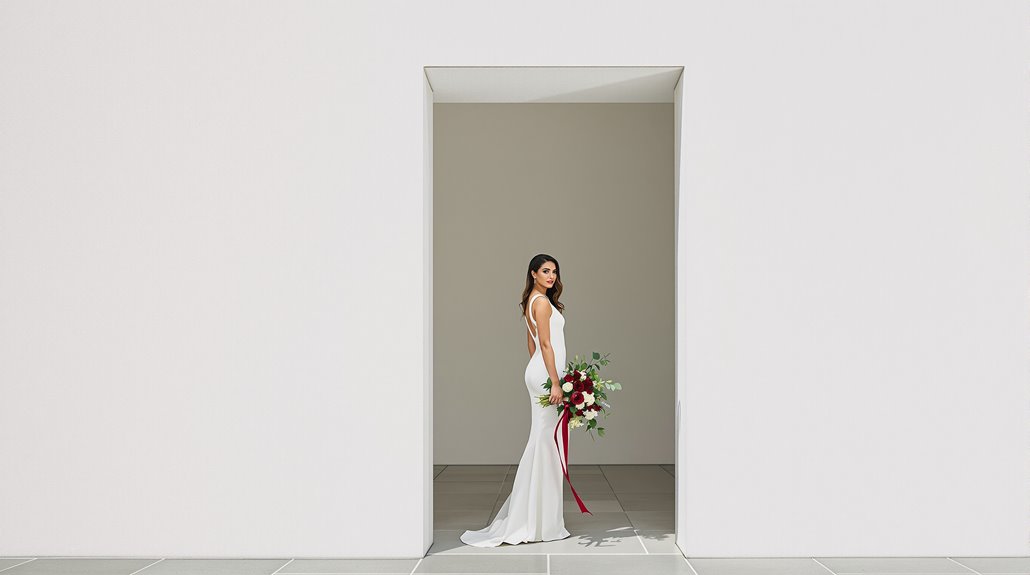
Beyond mere aesthetics, color palettes function as silent architects of your wedding’s emotional scenery, constructing invisible bridges between your inner world and your guests’ experience. Your choice of burgundy over scarlet, sage over emerald—these aren’t trivial distinctions but profound declarations of identity, relationship dynamics, and future aspirations.
You’ve selected colors that speak volumes—7 different messages to 4 distinct audiences—before anyone utters a word. The metallic copper accents you’ve chosen broadcast prosperity; the dusty blue whispers tranquility. And yet, the most powerful color stories emerge from unexpected combinations: black with blush creating tension between mystery and innocence, gold with navy balancing tradition against boldness.
Whether you’ve embraced lively jewel tones or subdued neutrals, your palette has crafted the emotional atmosphere that guests will remember long after centerpieces fade. Your colors aren’t decorations—they’re autobiography, manifesto, and promise all at once.

