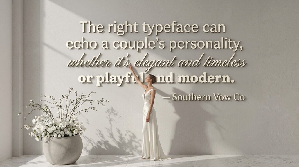
Typography isn’t decoration—it’s your silent voice. Your font choice communicates personality in milliseconds before readers process a single word. Serif fonts project tradition and authority (+13% trustworthiness), sans serif signals modernity and efficiency, while script fonts convey warmth and authenticity. When typography contradicts your message, 68% of viewers question your credibility. Choose fonts that genuinely reflect who you are, not who you think you should be. The right typographic voice creates harmony between what you say and how it appears.
Typography as Voice Communication – Essay opening
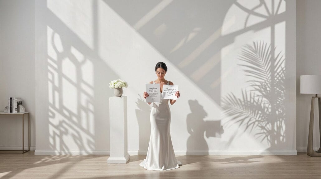
What you see speaks before you read. Typography as voice establishes your entire message’s emotional foundation in milliseconds—long before readers process a single word. Your fonts convey personality instantly, invisibly shifting expectations, creating trust or suspicion, warmth or distance. That carefully selected invitation font meaning transmits signals about your event’s formality, creativity, or traditionalism before guests comprehend venue details or RSVP instructions.
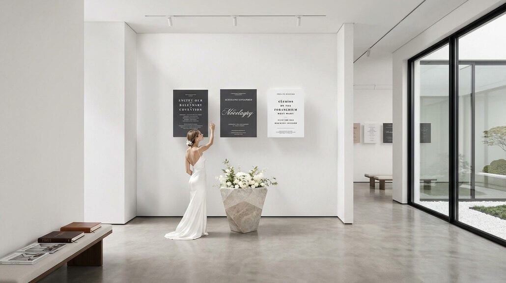
Consider how distinctly you hear these statements: “Please join us for dinner” feels wildly different in Garamond (cultivated, established), Futura (modern, confident), or Zapfino (romantic, elaborate). Each typeface projects specific voice qualities—volume, accent, cadence—communicating as surely as vocal inflection. This silent communication system works because serif typefaces convey heritage and authority while humanist sans serifs communicate warmth and approachability, with each typeface cue operating subconsciously to influence audience perceptions. Jewish wedding invitations traditionally demonstrate this principle, where ketubah calligraphy and invitation typography signal reverence for ceremony while establishing the event’s spiritual formality. And yet, most people select fonts impulsively, choosing “what looks nice” instead of what authentically speaks their intended message. Typography isn’t decoration; it’s your first, most efficient communication tool—the visual equivalent of tone, personality, and intention.
What Serif Fonts Say
Serif fonts speak volumes before your brain even registers their message. Those tiny “feet” at the letter ends aren’t just decorative—they’re working psychological levers, pulling 13% higher trust ratings in studies. You’re triggering immediate emotional associations of stability and authority without saying a word. Research by Monotype and Neurons has demonstrated that serif typefaces significantly influence emotional responses in readers without their conscious awareness.
| Serif Traits | What They Signal |
|---|---|
| Traditional styling | Respectability, establishment |
| Letter “feet” | Stability, structure |
| Historical usage | Academic credibility |
| Flow between letters | Reading comfort |
| Institutional adoption | Professional standing |
When The New York Times or Time magazine needs to convey trustworthiness, they don’t experiment—they deploy serifs. And yet, this isn’t merely about looking stuffy; it’s tactical communication. Your wedding invitation in Garamond tells guests “this is dignified” while your business proposal in Times New Roman whispers “I’m reliable” directly to the decision-maker’s subconscious. The evidence is clear: serif fonts accentuate credibility. Luxury cosmetics brands like Dior Beauty understand this principle, using refined serif typography to communicate elegance and haute couture sophistication in their visual identity.
What Sans Serif Fonts Say
While serif fonts anchor us in tradition, sans serif fonts catapult us into modernity—without saying a single word. When you choose these clean-lined letterforms, you’re telling your audience you value clarity above ornamentation, efficiency over embellishment. These fonts—the darlings of Apple, Nike, and virtually every tech startup worth its venture capital—speak in a voice that’s approachable yet professional, minimal yet confident.
Your sans serif selection broadcasts digital fluency and contemporary relevance. It’s why Helvetica dominates corporate rebrandings and why your screen-reading experience right now likely involves a sans serif font. The absence of those finishing strokes creates breathing room, allowing your message—not its decorative container—to take center stage. And yet, this modernity isn’t without warmth; these fonts feel friendly, accessible, democratized. They invite quick scanning rather than reverent reading, positioning you as someone who respects your audience’s time and intelligence. Interior design professionals, like those connected through the American Society of Interior Designers, understand this principle extends beyond digital screens to the built environment, where typography choices shape spatial experiences and brand identities.
What Script Fonts Say
Between the rigid traditionalism of serifs and the stark modernity of sans serifs lies the deeply personal world of script typography—your visual handshake before any actual introduction. When you choose script fonts, you’re not selecting mere letters; you’re broadcasting your personality across the page in flowing, connected strokes.
Script creates an immediate emotional connection through its mimicry of human handwriting—elegant calligraphic forms that whisper luxury, or casual scrawls that feel authentically yours. It’s versatile, yet contradictory: formal enough for wedding invitations, playful enough for creative projects. The thin strokes and decorative flourishes signal refinement, exclusivity, authenticity.
Your script choice reveals volumes. Formal calligraphic scripts announce traditional sophistication; casual variants declare approachability. In the floral industry, script fonts often grace bouquet cards and event signage, where that handwritten quality reinforces the organic, personal nature of giving flowers. Either way, they’re unmistakably human in a digital terrain—perfect when you need your typography to feel less like typesetting and more like an extension of yourself, breathing life into otherwise static communication.
Identifying Fonts Matching Your Personality
Finding the perfect typographic voice requires an honest assessment of who you truly are—or at least who you’re attempting to appear to be. Are you genuinely traditional and reliable? Serif fonts—with their mature, stable personalities—will telegraph that instantly. Your invitation font meaning becomes clear without a single word read.
Typography conveys voice more powerfully than most realize. Studies indicate 65% of Gen Z and 67% of Millennials consider fonts core components of self-expression. The question isn’t simply aesthetic but authentic: does your typography match your actual personality?
Consider the ten personality dimensions identified in research: legible, cheerful, fearful, creative, attractive, formal, sloppy, relaxed, friendly, and confident. Which traits define you? Sans-serif suggests approachability and modernity; script communicates elegance and creativity. But beware—mismatched fonts personality creates cognitive dissonance, like wearing a tuxedo to the beach. Your typographic voice must align with your authentic self. Just as creative interior design relies on thoughtful choices that reflect authentic personality, your typography should tell a story consistent with who you are.
Type Selection as Voice Decision
Your font choice meaning extends beyond aesthetics—it’s the visual equivalent of your vocal tone. Traditional serifs communicate like a measured, authoritative speech pattern; sans serifs project the straightforward cadence of contemporary conversation. And yet, the most effective font personality emerges when selection aligns authentically with content. The typographic voice that strikes a chord isn’t necessarily the most beautiful, but the one that creates coherence between what you’re saying and how it appears—a visual frequency that harmonizes with your message’s true nature. Historic hotels understand this principle deeply, where architectural typography and signage have preserved culinary heritage and cultural identity for over a century, demonstrating how visual voice endures across generations.
Avoiding Fonts Saying Things You Don’t Mean
When typography contradicts your intended message, you’ve undermined your brand before speaking a single word. That wedding invitation typography voice? It whispers “casual picnic” when you’ve planned a black-tie affair—68% of viewers instantly question your credibility. Cognitive dissonance forms in milliseconds.
Your fonts convey voice whether you’re conscious of it or not. That quirky display face on financial documents? It’s silently eroding trust. Traditional serifs signal reliability; modern sans-serifs communicate innovation; scripts suggest personal elegance—and misalignment between these qualities and your actual message creates jarring discord.
The typography personality you project isn’t just aesthetic window dressing but fundamental communication architecture. Consider how readers rate identical text as more credible in traditional fonts but more energetic in contemporary ones. Your typographic choices frame interpretation before conscious processing begins. Beautiful fonts applied inconsistently or inappropriately don’t improve your brand—they actively damage it, creating visual confusion rather than recognition. Just as professional photo editing tools enhance visual quality across platforms, typography requires consistent application to maintain your brand’s intended voice and credibility.
Conclusion
Although we perceive typography as merely decorative, it functions as your brand’s most fundamental voice—speaking continuously through every digital and physical interaction. Your invitation typography voice reaches audiences before a single word registers consciously, establishing expectations that frame everything that follows.
| Font Type | Communicates | Best For |
|---|---|---|
| Serif | Tradition, authority | Established institutions |
| Sans Serif | Clarity, modernity | Tech, healthcare, education |
| Script | Personality, warmth | Events, luxury, creativity |
Fonts communicate personality whether you intend them to or not—silent but persistent ambassadors working relentlessly across every point of contact. Typography as communication isn’t optional; it’s inevitable. You’re always saying something with your type choices, so make them deliberate extensions of your tactical voice. For formal invitations that demand elegance and authority, consider pairing your typography with fine stationery that reinforces the sophistication your fonts convey.
The question isn’t whether typography speaks for you—it’s whether you’ve taught it to say what you actually mean.