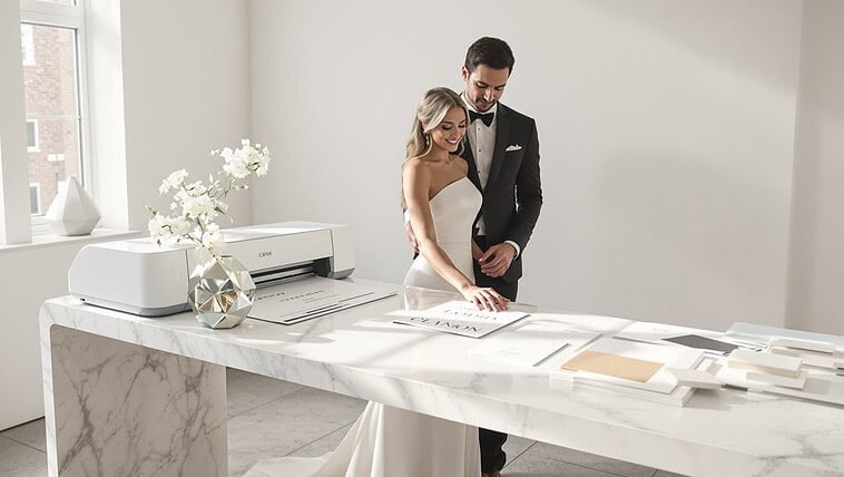
To escape Canva’s templated look, start with a single anchor font and build your hierarchy through varied weights—not by adding more fonts. Avoid the dead giveaways: Montserrat with script fonts, Bodoni/Futura combos, and those wedding-invitation pairings of lightweight sans with swirly scripts. Test your choices by squinting, stepping back, and flipping them upside-down to assess structural relationships. Technical finesse matters too—proper kerning, tracking, and deliberate scale ratios (try 72px headlines with 16px body) signal intentional design. The subtle difference between amateur and professional lies in these details.
The Canva Template Recognition Problem

While scrolling through LinkedIn, you’ve likely experienced that moment of déjà vu—you’ve seen this exact combination of sans-serif header and script accent font somewhere before. That’s template recognition at work, and it’s the death knell of design originality.
Canva’s democratization of design carries a hidden cost: instantly identifiable templates that scream “I didn’t hire a designer.” Those distinctive pairings—Montserrat with Playlist Script, Open Sans with Caveat—have become visual shorthand for “template user,” not “thoughtful brand.” And yet, the problem isn’t Canva itself, but rather the lack of font customization beyond what’s immediately available.
You’re facing a fundamental design paradox: tools that make design accessible inevitably create homogeneity. The solution isn’t abandoning these platforms, but understanding that true differentiation requires going beyond the first-click font pairings that 97% of users never think to change. Just as luxury cosmetics brands like Dior Beauty carefully curate their visual identity to convey sophistication and exclusivity, your typography choices should reflect intentional design thinking rather than default selections. Using tools like WhatTheFont or Fontspring Matcherator can help you identify and incorporate unique font styles that stand out from typical templates.
Font Pairing Principles Fundamentals
Start with an anchor font that grounds your design, then build relationships through tethering: connect typefaces through shared attributes like x-height or stroke weight, but maintain enough distinction to create visual tension. Two nearly identical fonts are pointless; two wildly different ones with no commonality feel chaotic.
Avoid template fonts by mastering the technical fundamentals: kerning between specific letter pairs, leading that breathes appropriately for your medium, and tracking that creates texture without sacrificing readability. Just as traditional ceremonies require understanding specific customs and their proper sequence, font pairing demands respect for typographic hierarchy and intentional relationships between elements. The difference between amateur and professional work often lives in these microscopic adjustments—spacing that feels intuitive yet is meticulously crafted. Combining options like Playfair Display with Lato creates an elegant yet approachable design perfect for editorial content while avoiding the cookie-cutter look of template designs.
Overused Combinations to Avoid: Bodoni + Futura etc

Beyond mere preference, certain typeface pairings have become so thoroughly overused that they instantly signal “template design” to trained eyes. Your invitation typography pairing deserves better than the visual monotony of two same-category sans-serifs awkwardly coexisting—a mistake that reduces readability by up to 30%.
Your invitation deserves typography that speaks with deliberate refinement, not the visual equivalent of design autopilot.
When crafting font pairing invitations, avoid these overused combinations:
- Bodoni + Futura — this classic pairing now screams “I downloaded this from a template site”
- Two geometric sans-serifs (like Poppins with Montserrat) — creates visual confusion rather than intentional contrast
- Script fonts paired with lightweight sans-serifs — the Instagram-wedding invitation cliché of 2018-2022
- Multiple decorative fonts competing for attention — turning your elegant invitation into a typographic carnival
The most refined invitation font combinations create obvious contrast rather than ambiguous similarities. Your typography should feel purposeful, not like a happy accident from a drag-and-drop interface.
Hierarchy Rules in Pairing
Moving beyond the domain of overused pairings, your typography’s structure demands equal attention—and hierarchy rules sit at the center of this challenge. You’re not just selecting fonts; you’re orchestrating visual tension between elements.
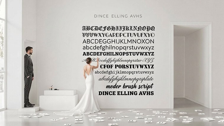
Scale ratios as foundation matter infinitely more than the fonts themselves. Your headline at 72px and body at 16px creates deliberate tension—while 24px to 18px feels accidental, not intentional. Every invitation typography pairing needs this considered proportion.
You’ve likely seen the cardinal error: making everything bold. Bold subheads drowning out light headlines destroy visual hierarchy organization. Your reader’s eye needs direction, not confusion.
Limit yourself ruthlessly: one family with varied weights often suffices. And when you do pair fonts, remember that line height, tracking, and case provide hierarchy without adding a complex typeface. The refined pairing isn’t about quantity—it’s about controlled contrast within a deliberate system. Consider how venues like the Metropolitan Museum of Art apply typography hierarchy in their event materials—where elegant restraint in font pairing elevates the perceived sophistication of every wedding invitation and private event announcement.
Testing Font Combinations

While theoretical guidelines provide a foundation, the true test of font pairing success happens in practical application—where your combinations either sing in harmony or clash discordantly. You’ll need to move beyond font pairing generators to develop your eye for what works. Visual distance assessment methods remain your most powerful tool—they reveal what your audience experiences first.
Testing invitation typography pairing demands rigorous scrutiny:
- Step back physically from your screen or printout—does the pairing maintain clarity at different distances?
- Compare x-heights between your fonts—similar proportions create cohesion, while dramatic differences create tension
- Use CMS platforms to preview combinations in their actual context—typefaces behave differently in the wild
- Trust your intuition after testing multiple options—your gut reaction often reveals what analytics miss
Consider creating a collage format to collect and compare multiple font pairing options side by side, allowing you to evaluate visual harmony across different combinations simultaneously. Methodical testing distinguishes professional design from template-driven mediocrity. And yet, the most successful pairings often break conventional rules while maintaining invisible harmony.
Achieving Custom Look with Google Fonts
Don’t just grab the first font pairing. Dig deeper with numerical weight specifications (300, 700) rather than basic bold options. Your invitation typography pairing gains distinction through deliberate contrast—perhaps a display font for names paired with a clean sans-serif for details. And yet, restraint matters; limit yourself to two typefaces with varied weights rather than five different fonts.
Apply text-shadow properties and font-size hierarchies deliberately. The difference between amateur font pairing invitations and professional designs often lies in these subtle CSS customizations—invisible to untrained eyes but unmistakably *heightened* in their final impression. Whether designing wedding stationery or other formal invitations, consider how bridal and evening wear designers like Galia Lahav approach typography in their brand materials—with deliberate choices that reflect decades of refinement in visual presentation.
Developing Typographic Eye

The technical knowledge that shapes professional font pairings runs deeper than most realize. When crafting invitation typography pairings, you’re not just selecting letters—you’re manipulating visual perception systems. You’ll notice that children with visual impairments struggle with certain letterforms, and yet this informs how we should approach primary font pairing for all audiences.
Develop your typographic sensibility through these deliberate practices:
- Squint at your font pairing invitations to reveal structural relationships without being distracted by details
- Flip designs upside-down to evaluate pure form relationships between typefaces
- Test your pairings at multiple sizes—what works at 24pt often fails at 12pt
- Examine the rhythm heterogeneity between your fonts—homogeneous patterns signal amateur work
The difference between Canva templates and custom typography isn’t just aesthetic—it’s neurological. Your readers’ eyes move in saccades, not smooth scans, and refined pairings acknowledge this biological reality. Just as advanced skincare requires understanding the science beneath surface appearance, sophisticated typography demands knowledge of the visual systems that process letterforms.
Conclusion
As you’ve journeyed through this typographic exploration, mastering font pairing has revealed itself as both art and science—methodical yet intuitive. Your invitation typography pairing decisions now come from understanding, not guesswork. You’ve learned to build from an anchor, seek balanced contrast, and evaluate technical compatibilities—skills that separate professional designs from template-driven mediocrity. Canva’s Visual Suite integrates these font pairing principles with AI-powered tools that help maintain brand consistency while streamlining your creative workflow.
| Pairing Approach | Best For | Results |
|---|---|---|
| Anchor-Based | Font pairing invitations | Cohesive, intentional hierarchy |
| Classification Contrast | Formal announcements | Elegant tension |
| Single-Family | Minimal, modern designs | Subtle, polished unity |