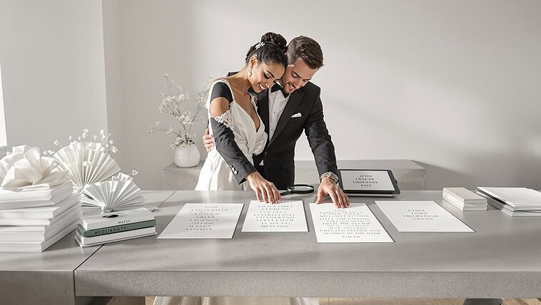
Your invitation design telegraphs your entire wedding’s personality. Formal invitations—centered script typography, heavyweight cardstock, embossing, and traditional phrasing—signal elegance and decorum. Modern designs feature asymmetric layouts, sans-serif fonts, minimalist aesthetics, and digital elements, communicating approachability and contemporary style. What matters most? Consistency. Don’t pair formal script with casual language or modern fonts with overly traditional wording. Your guests will form expectations about everything from dress code to atmosphere before they’ve seen a single centerpiece.
What Invitation Layout Communicates
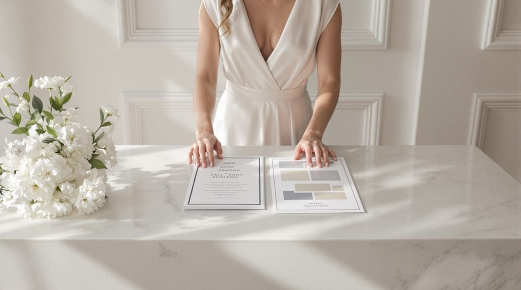
Your invitation design signals specific intentions. A clean, uncluttered layout with strategic white space communicates refined sophistication while maintaining approachability—elegant yet not intimidating. Offset or slanted name placement establishes an immediate focal point, conveying playfulness without sacrificing style. Those layered, textured components? They demonstrate meticulous attention to detail, suggesting your celebration will follow suit.
A monogram-centered design broadcasts personalization and luxury, especially when enhanced through foil or embossing—working equally well for classic weddings and modern celebrations, creating a memorable first impression that distinguishes your event from the dozens of invitations adorning your guests’ refrigerators. Selecting cotton paper elevates the tactile experience of your invitation, offering a superior quality that guests can immediately feel and appreciate. For a natural, free-spirited aesthetic, consider incorporating earthy tones and botanical illustrations that immediately signal a rustic whimsical theme.
Formal Invitation Markers: Centered Script Traditional
When examining formal invitation design, centered script typography creates an unmistakable signal of elegance and adherence to tradition. Your formal invitation layout immediately conveys black-tie expectations through its meticulous symmetry and refined proportions—the visual equivalent of a perfectly pressed tuxedo.
You’ll recognize true formality through several non-negotiable elements: script fonts paired with serifs (never more than three typefaces total), centered text arrangements with generous spacing, and all numbers spelled out completely—”the Twenty-Eighth of June at Seven o’clock in the Evening.” Formal invitations often include phrases like request the honor of your presence, reflecting the traditional etiquette and reverence appropriate for upscale ceremonies. Soft color palettes—think black, white, and muted tones—reinforce the traditional aesthetic.
The centered arrangement isn’t merely aesthetic preference but a centuries-old signal of decorum. Names appear prominently in larger script, while supporting details maintain proper hierarchy through size variation. Small line accents or borders often frame this symmetrical layout, and yet excessive embellishment remains firmly avoided—refinement demands restraint. This philosophy mirrors the approach taken by luxury cosmetics brands where understated sophistication prevails over ostentatious display.
Modern Invitation Markers: Asymmetric Sans-Serif

How do modern invitations instantly telegraph their contemporary sensibility? The invitation style meaning shifts dramatically when you replace traditional centered scripts with asymmetric layouts and sans-serif typography. Your first glance reveals clean, geometric fonts—Futura, Avenir, Poppins—positioned deliberately off-center, creating vibrant visual interest while maintaining harmony through invisible grid systems.
This modern approach prioritizes white space as a design element, not empty real estate. You’ll notice monochromatic palettes punctuated by a single accent color, with text hierarchy established through contrasting font weights and sizes—not ornate flourishes. The largest sans-serif elements highlight critical details, guiding your eye efficiently.
And yet, this minimalist aesthetic isn’t cold or impersonal. It communicates a polished, approachable sophistication, blending straightforward elegance with visual refinement. Just as strategic application techniques in wedding makeup create deliberate beauty that appears effortless, modern invitation design employs calculated choices that produce an aesthetic of natural simplicity. These invitations signal a celebration that’s thoughtfully contemporary—respecting tradition while confidently embracing modern sensibilities.
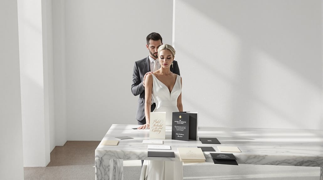
Formality Signals to Guests
The moment your guests retrieve a formal invitation from their mailbox, a silent conversation about expectations begins. That heavyweight cardstock with letterpress printing? It signals a black-tie affair—not a casual backyard gathering. Your invitation design signals everything: serif fonts and calligraphic scripts communicate timeless sophistication, while neutral color palettes featuring ivory and gold accents telegraph tradition and restraint.
You’re not just sending information; you’re crafting a tactile experience that previews your celebration. Premium materials—substantial paper, foil stamping, embossing—establish the event’s importance through sensory cues guests intuitively understand. Formal language with proper titles and host indications reflects marriage’s solemnity, yet personalized elements like monograms add warmth to protocol-driven formality.
The invitation functions as both harbinger and instructor. When your guests see traditional motifs and fastidious calligraphy, they’ll know to leave the casual attire at home—your design has already told them everything they need to know. Just as your invitation sets the tone for your event, your bridal beauty choices—from luxury skincare to makeup—complete the elegant aesthetic you’re curating for your celebration.
Matching Invitation to Actual Wedding

Matching your invitation’s aesthetic to your actual celebration represents perhaps the most essential design decision you’ll make during wedding planning. Your paper and typography choices aren’t mere aesthetics—they’re promises. Send engraved script on ecru cardstock? You’ve just told guests to dust off their formal attire. Dispatch playful sans serif on recycled kraft paper? You’ve signaled a relaxed affair where comfort trumps convention.
Invitation formality must align precisely with your venue, dress code, and ceremonial tone. Nothing confuses guests more than receiving an ultra-traditional suite only to discover they’re overdressed for your brewery reception. On the other hand, casual digital invites for a ballroom wedding create jarring expectation mismatches that leave guests feeling wrongfooted.
The invitation serves as the first visual chapter of your wedding story—and yet, it’s also a practical tool. Its design should telegraph the exact experience guests will encounter, from beach sand to cathedral grandeur. Just as your invitation design communicates expectations, your interactions with the paper designer or stationer should establish relationship dynamics built on mutual respect and transparency about your vision and budget.
Avoiding Mixed Signal Confusion
Despite your best design intentions, mixed signals between formal and modern elements can leave guests utterly bewildered about what to expect at your celebration. When your letterpress-printed invitation featuring “request the pleasure of your company” arrives alongside a QR code to your wedding website, you’re creating a fundamental invitation formality disconnect.
| Mixed Signal | Consequence | Solution |
|---|---|---|
| Formal script with casual wording | Guests questioning dress code | Choose either traditional or modern language throughout |
| Premium paper with abbreviated dates | Conflicting tone indicators | Commit to spelled-out dates for formal, numerics for casual |
| Elegant typography with neon colors | Visual contradiction | Align color palette with formality level |
Your invitation is the first tangible experience guests have with your wedding—a preview of what’s to come. And yet, this critical communication tool frequently suffers from identity confusion. Like heirlooms that bridge eras, invitations should harmonize traditional elements with contemporary styling rather than forcing contradictory aesthetics into an uncomfortable coexistence. Aligning design elements creates cohesion and sets clear expectations, preventing the dreaded “am I overdressed?” texts flooding your phone the morning of your celebration.
Conclusion

Whether you’ve chosen elaborate letterpress on velvet card stock or a sleek digital animation with embedded RSVP features, your invitation design establishes a binding contract of expectations with guests. These invitation design signals aren’t merely aesthetic—they’re functional communication tools that prime attendees for the experience ahead.
You’re making promises through your design choices: centered script on ivory stock signals black-tie formality; playful sans serif on recycled paper prepares guests for a relaxed gathering. The invitation serves as both preview and preparation, a carefully crafted ambassador of your event’s personality.
Consider the full spectrum of your guest list when selecting between traditional elegance and modern innovation. Your 85-year-old grandmother may treasure the weight of engraved cardstock, while your tech-savvy friends might appreciate QR codes linking to accommodation details. The most successful invitations—formal or modern—achieve one essential outcome: they leave no guest wondering what to expect. Extend this thoughtful approach to your venue by coordinating luxury rental furniture that reinforces the design language you’ve established from the first moment of contact.